
This was a design study on Sportchek that focused primarily on the UI for the mobile app. The company lacks a mobile application altogether and has a website that is cluttered and inconsistent.
Goal:
To develop a mobile UI layout with interacting screens and a working prototype as well as a redesign of the website UI. Promotional assets are also included to help advertise the new mobile app.
To develop a mobile UI layout with interacting screens and a working prototype as well as a redesign of the website UI. Promotional assets are also included to help advertise the new mobile app.
Challenges:
Maintaining all materials consistent, simple and clean. Since this is not a rebrand, the colours and typeface are both chosen to match the original.
Maintaining all materials consistent, simple and clean. Since this is not a rebrand, the colours and typeface are both chosen to match the original.
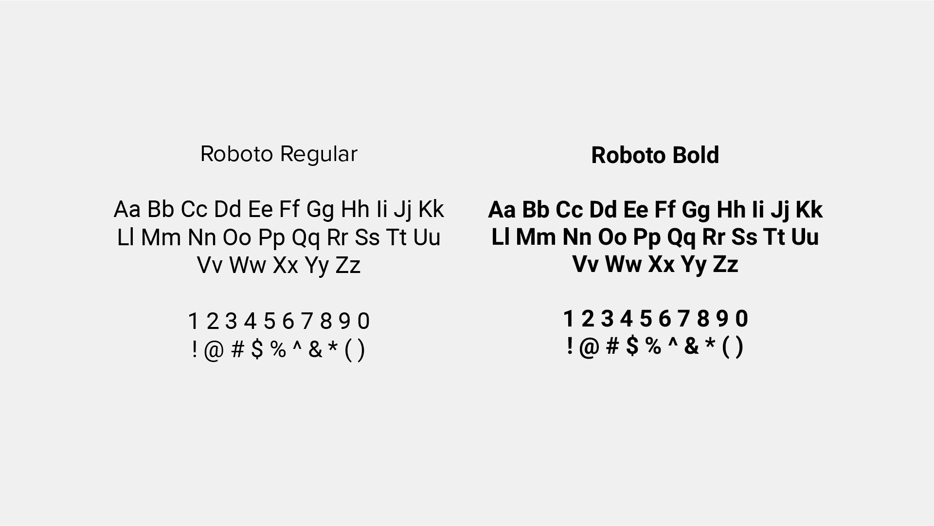
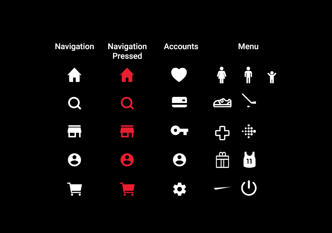
Style Guide
I went with an achromatic colour scheme of white, black and red for the highest contrast. In the mobile app, I included green to compliment the red and to bring attention to CTA and purchase buttons. Green also serves as a welcoming and positive colour that gives user confidence.
The typeface, Roboto, was chosen for its strong legibility and wide range of styles.

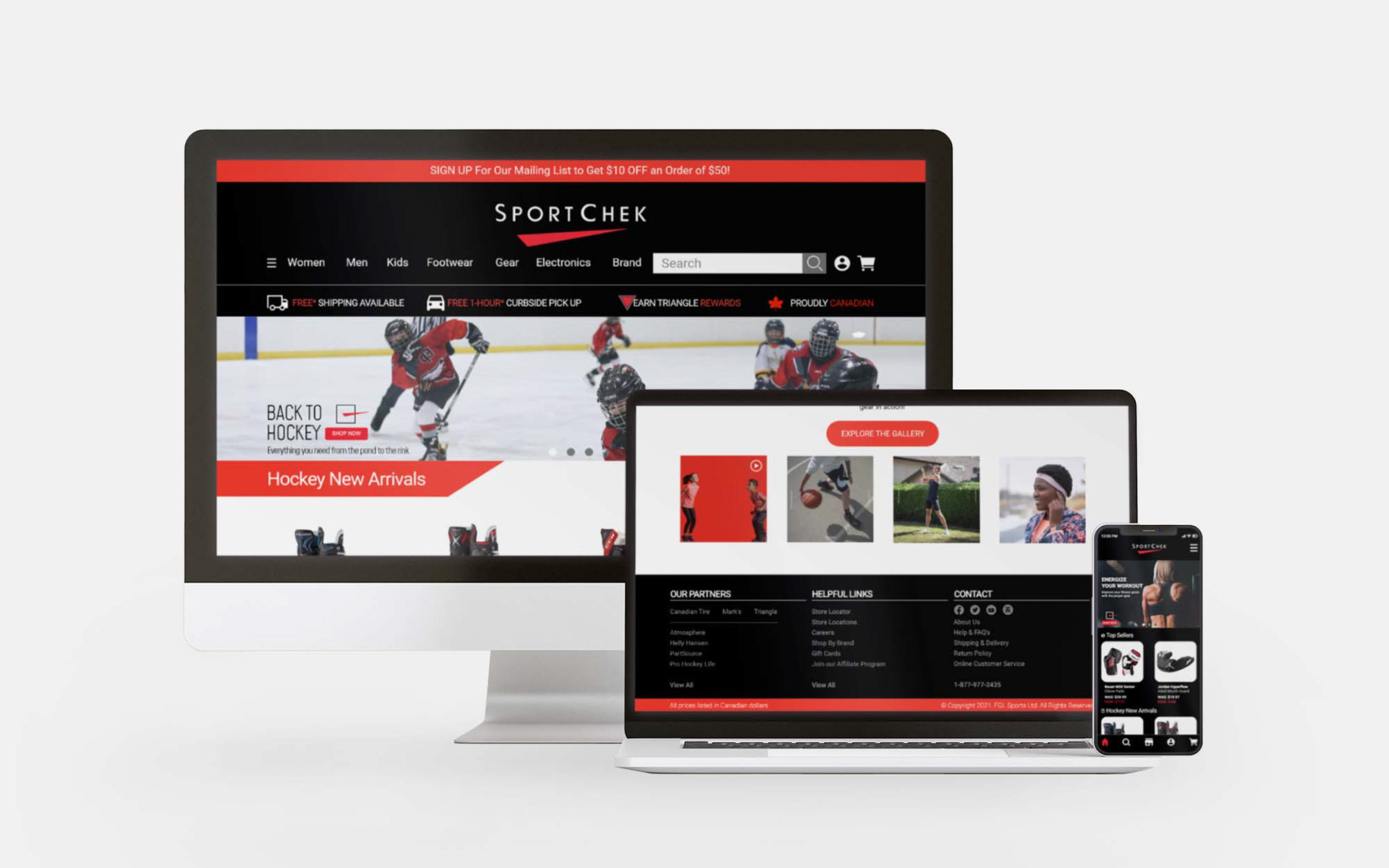
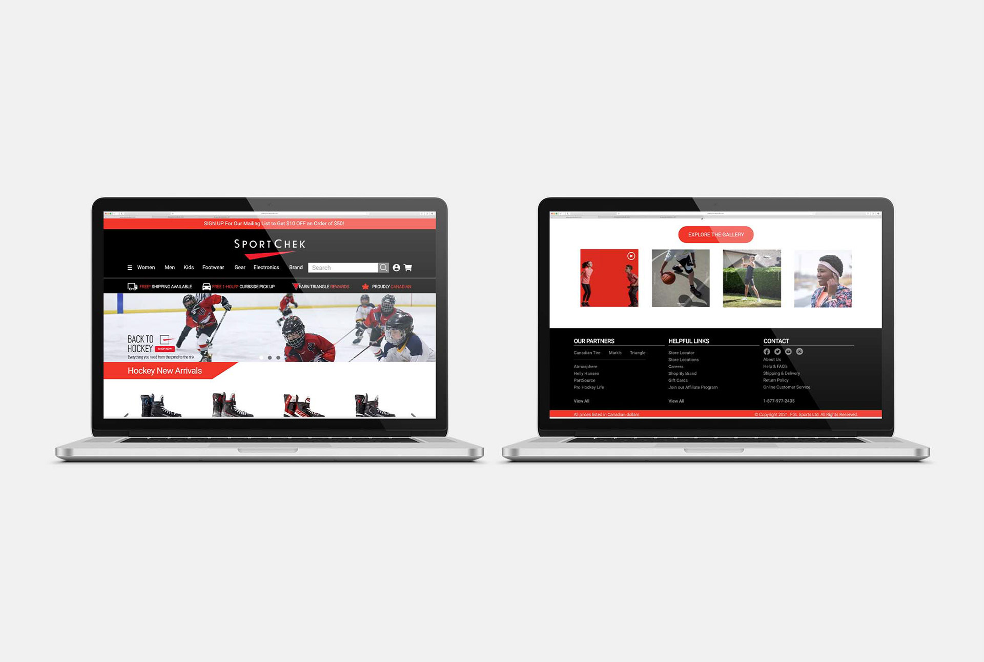
Website Redesign
Simplifying and removing clutter was a key factor. The use of repetition in typography, colour and design was used to create a fluid appearance throughout the website. Rearranged and reformatted headings to create a consistent look. Simplified the footer with hierarchy of information.
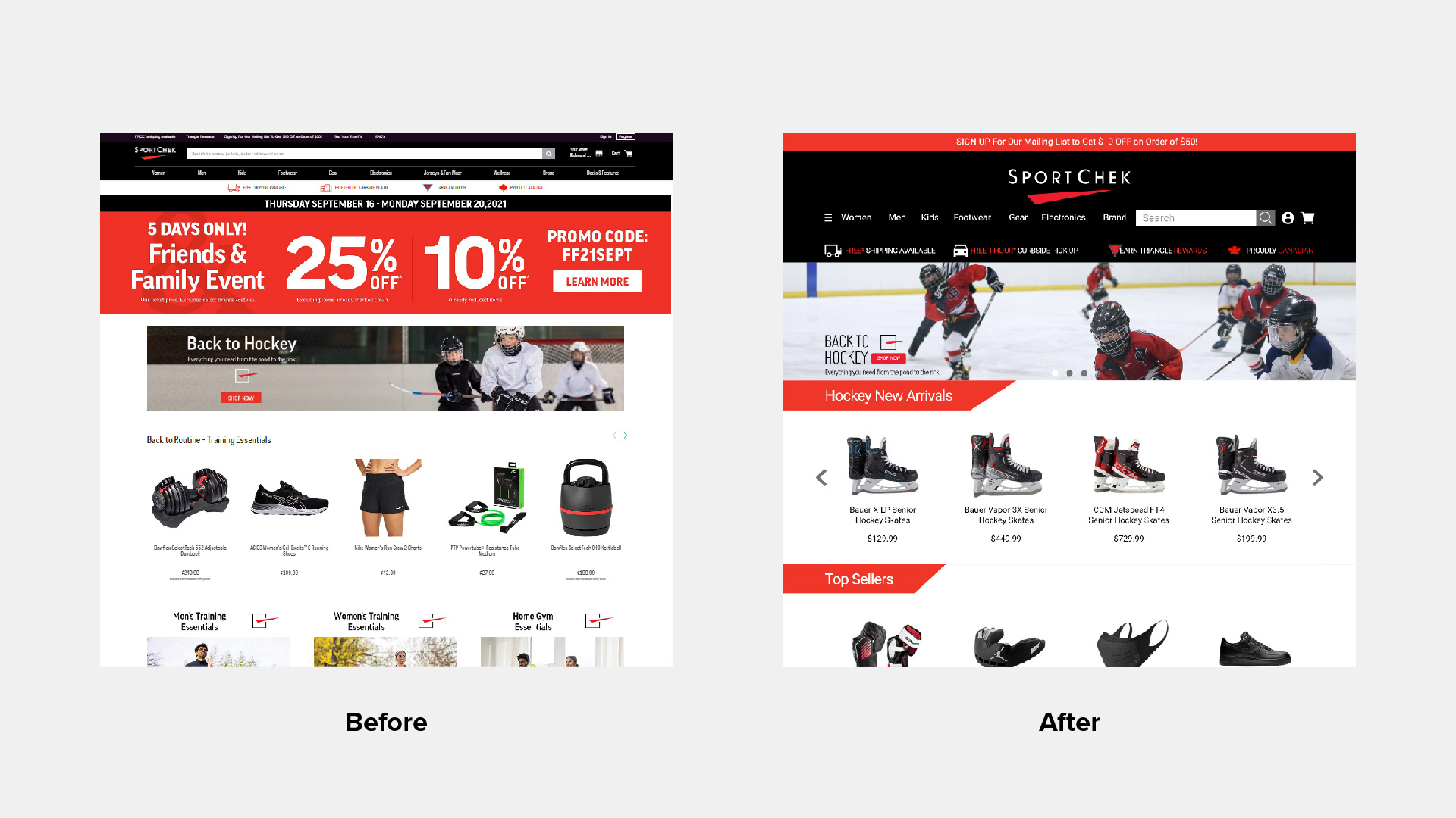
Website 1/3
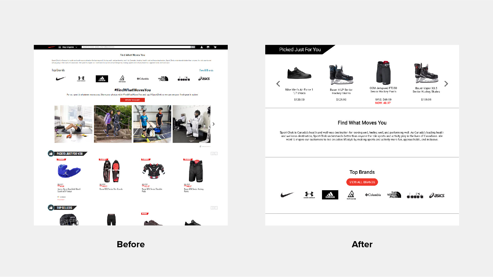
Website 2/3
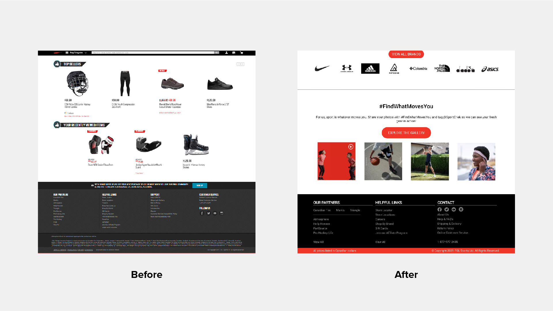
Website 3/3
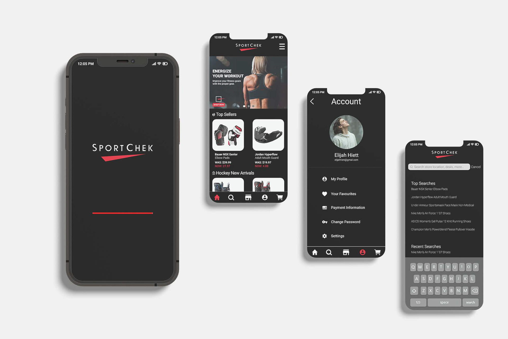
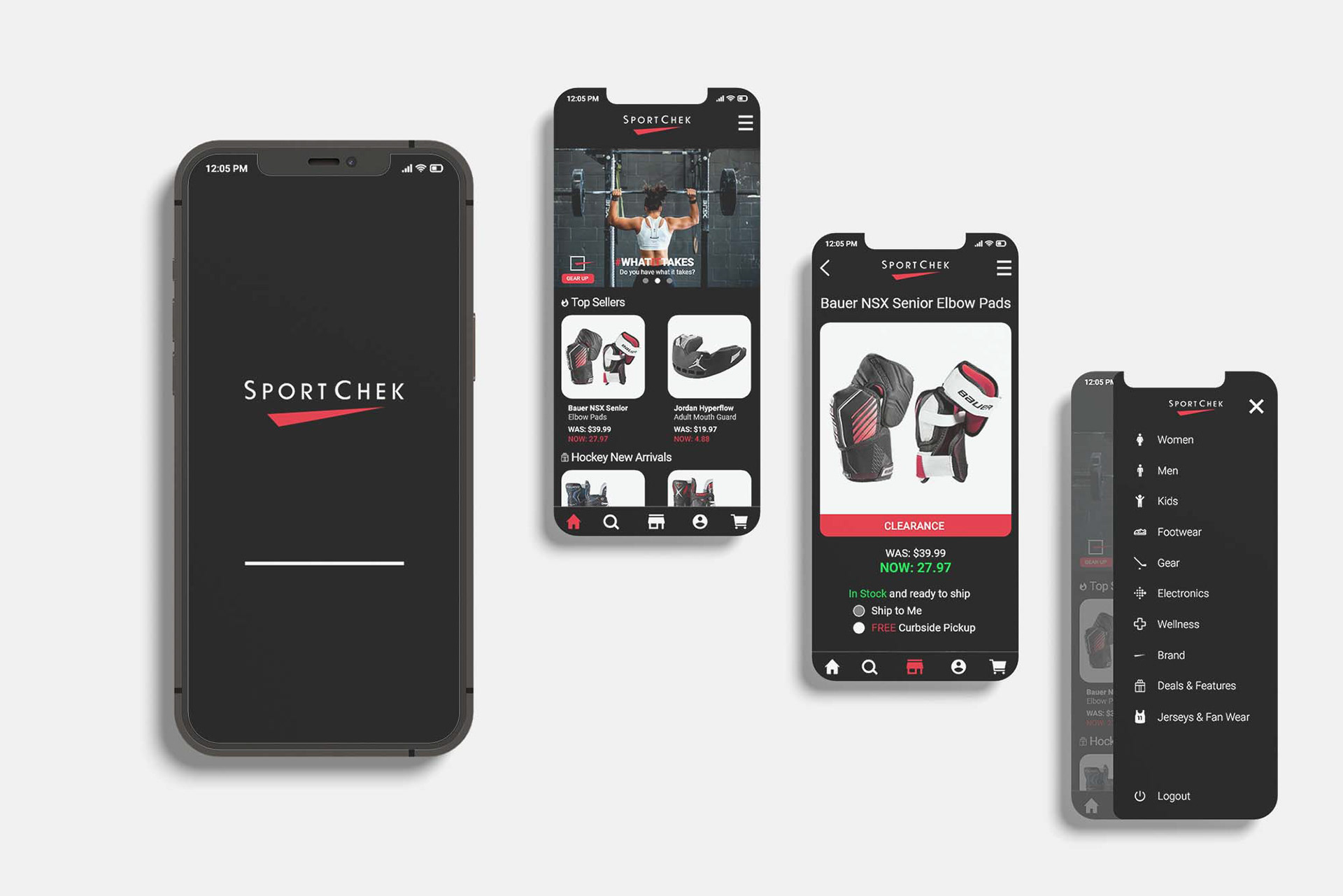
Mobile Layouts
I went with a black background for the mobile app to help emphasize the logo's bold red colour. It also aids in creating a modern and youthful appearance.
Print and Digital Assets
Full Page Poster ad (11x17")
Split Page ad (17x11")
Mobile app promos /Twitter post (390x260px)
Split Page ad (17x11")
Mobile app promos /Twitter post (390x260px)
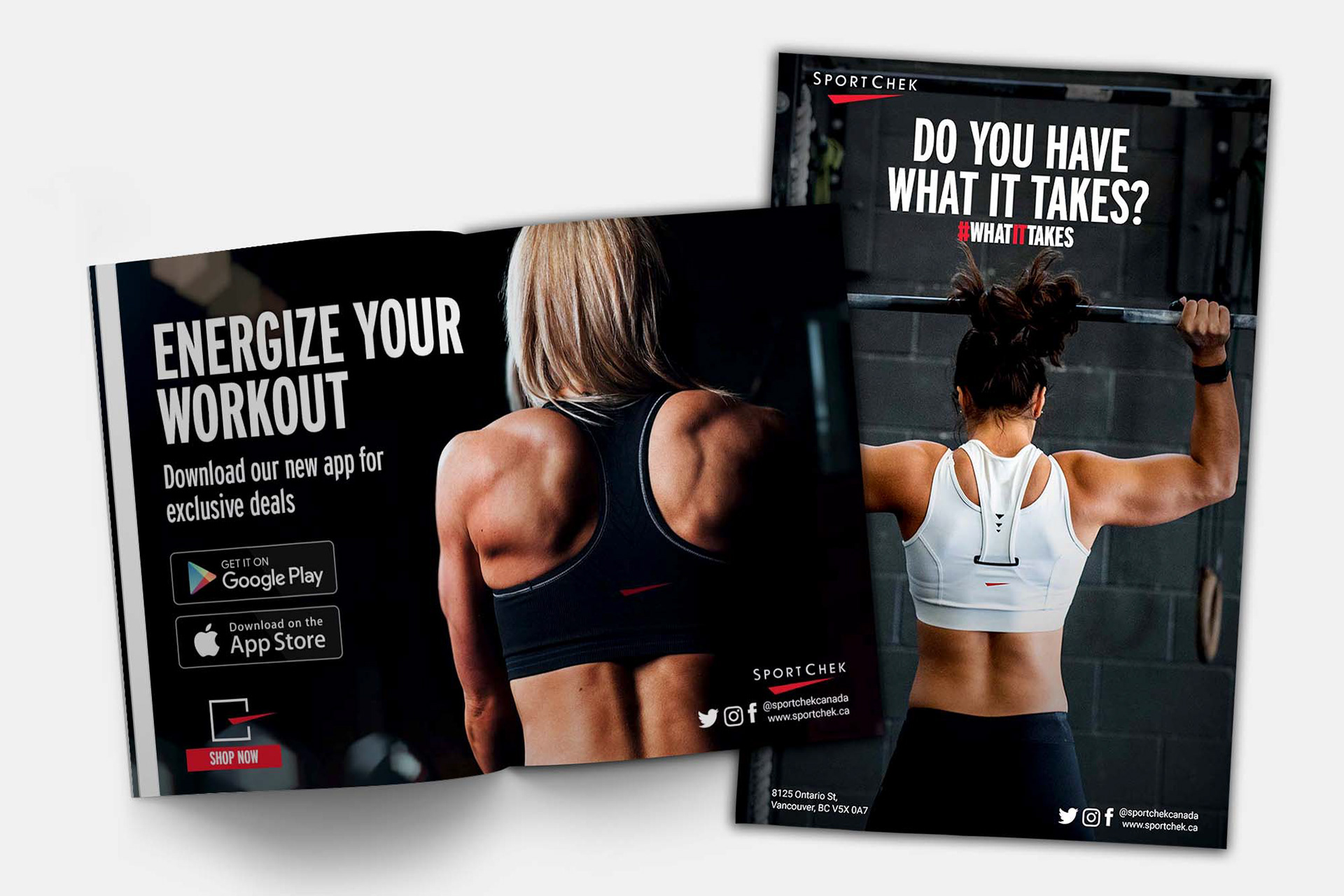
Split Page Left
Full Page Poster Right
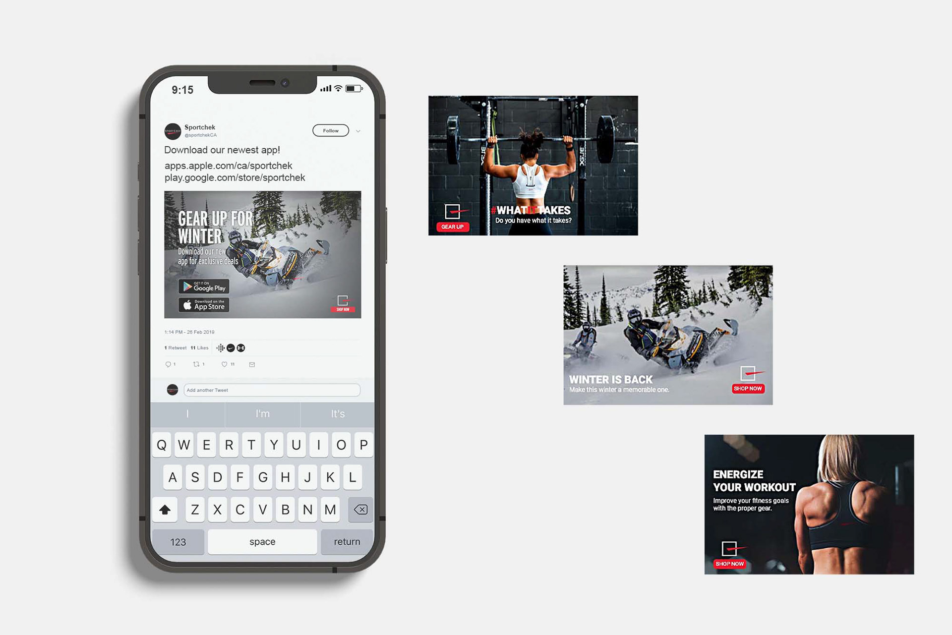
Twitter ad assets
Programs Used
Adobe InDesign, Adobe Photoshop, Adobe Illustrator, Adobe XD