
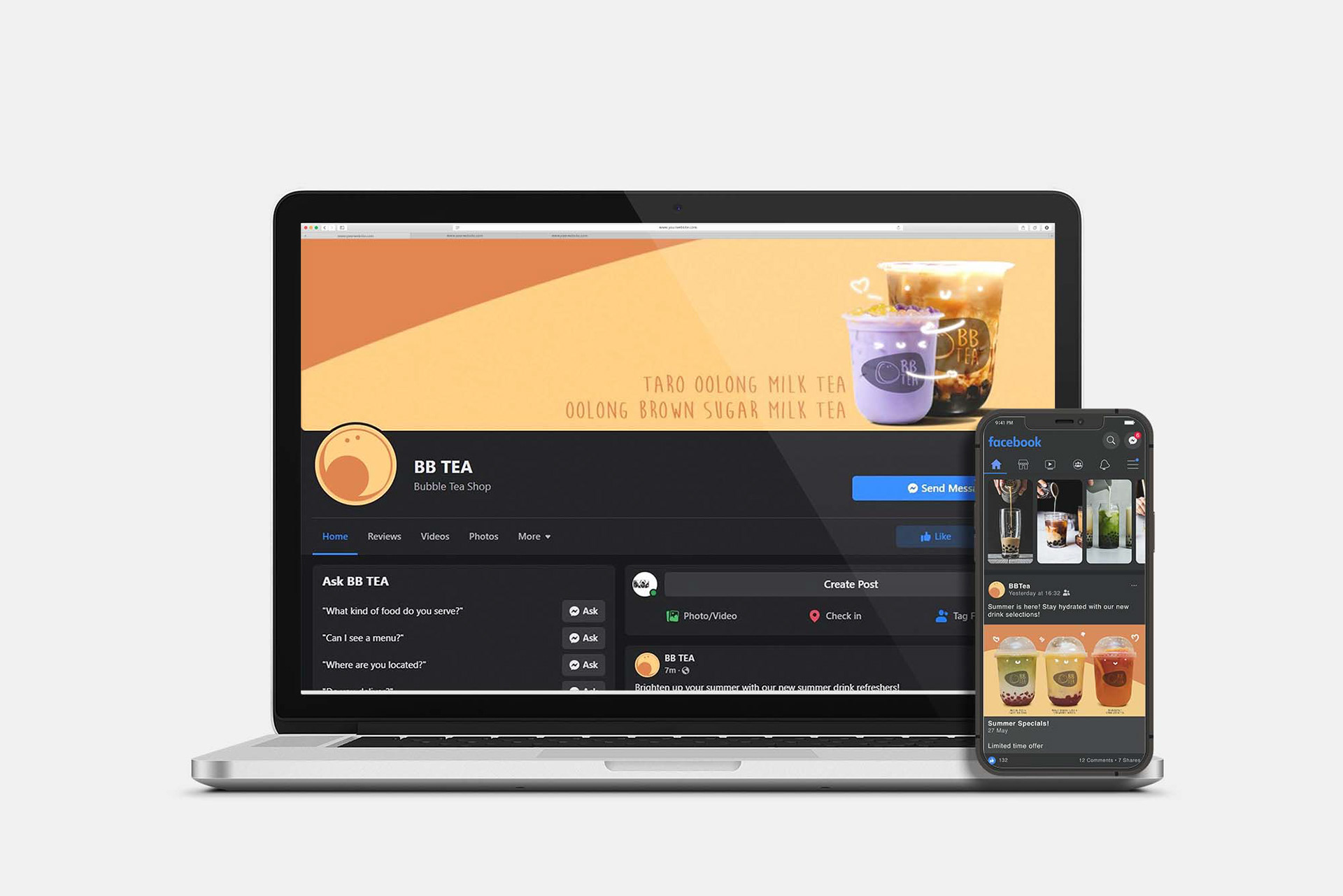
BBTea is a new bubble tea store located in Burnaby. It presents itself as a playful, affordable and casual alternative to other prominent brands as a means to attract a younger audience. The store features a mobile application, delivery service and a wide range of customization drink options.
Goal:
To develop a brand name, logo, and promotional material that is consistent throughout all platforms.
Goal:
To develop a brand name, logo, and promotional material that is consistent throughout all platforms.
Challenges:
Develop multiple print and digital assets including social media profile material while maintaining consistency.
Develop multiple print and digital assets including social media profile material while maintaining consistency.
Style Guide
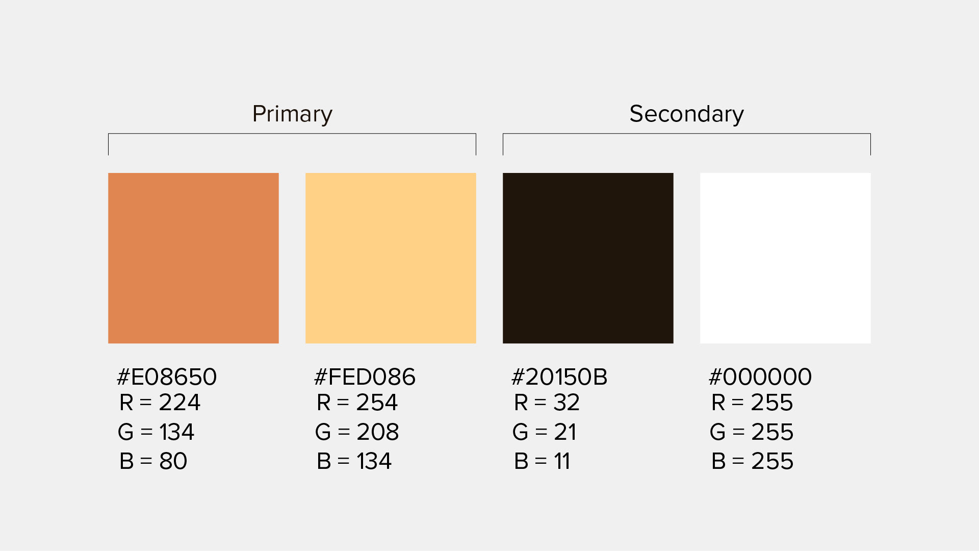
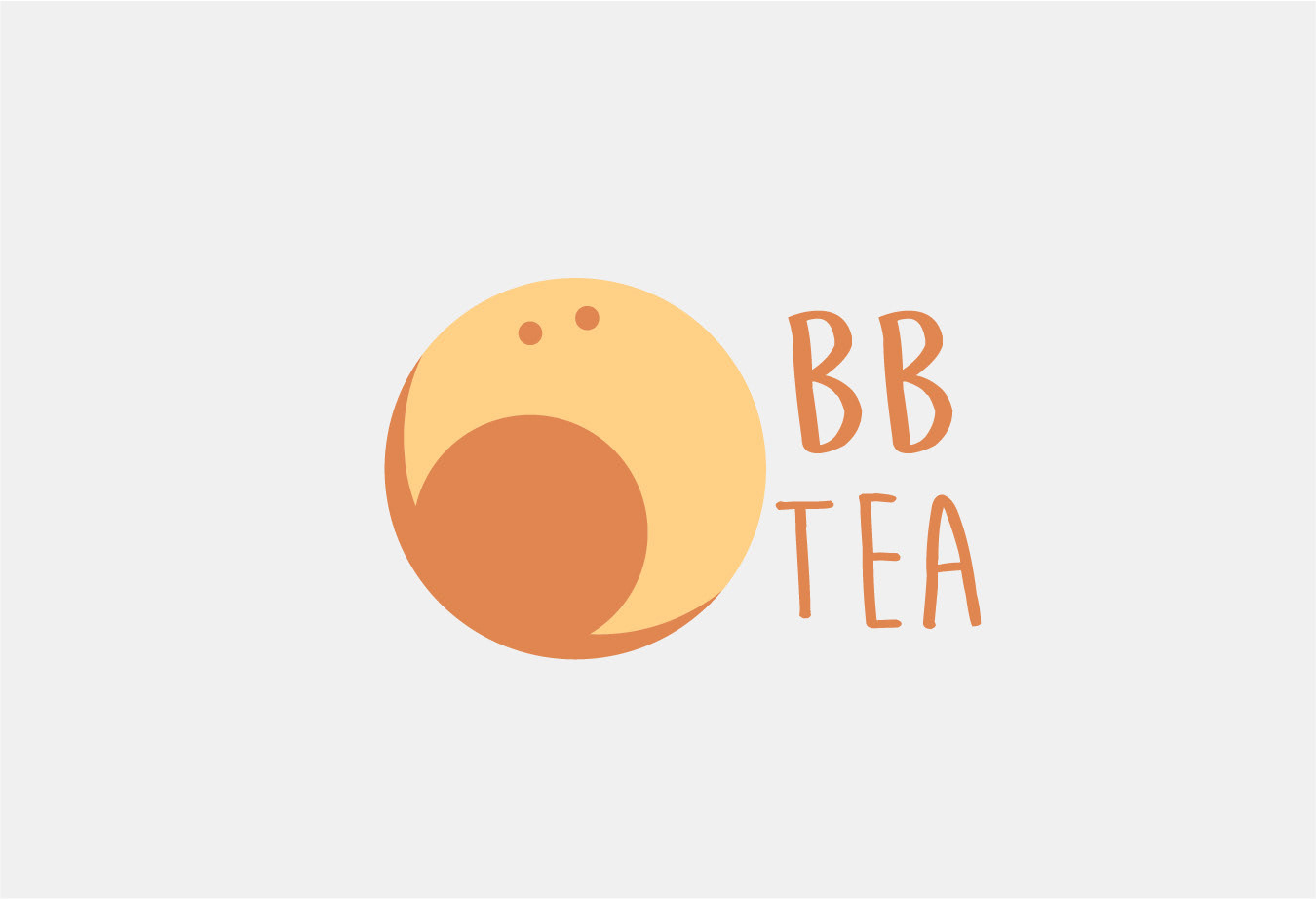
I used a warm monochromatic yellow-orange colour palette to help give the brand a warm ambiance of a café. Orange also aids as an appetizing colour.
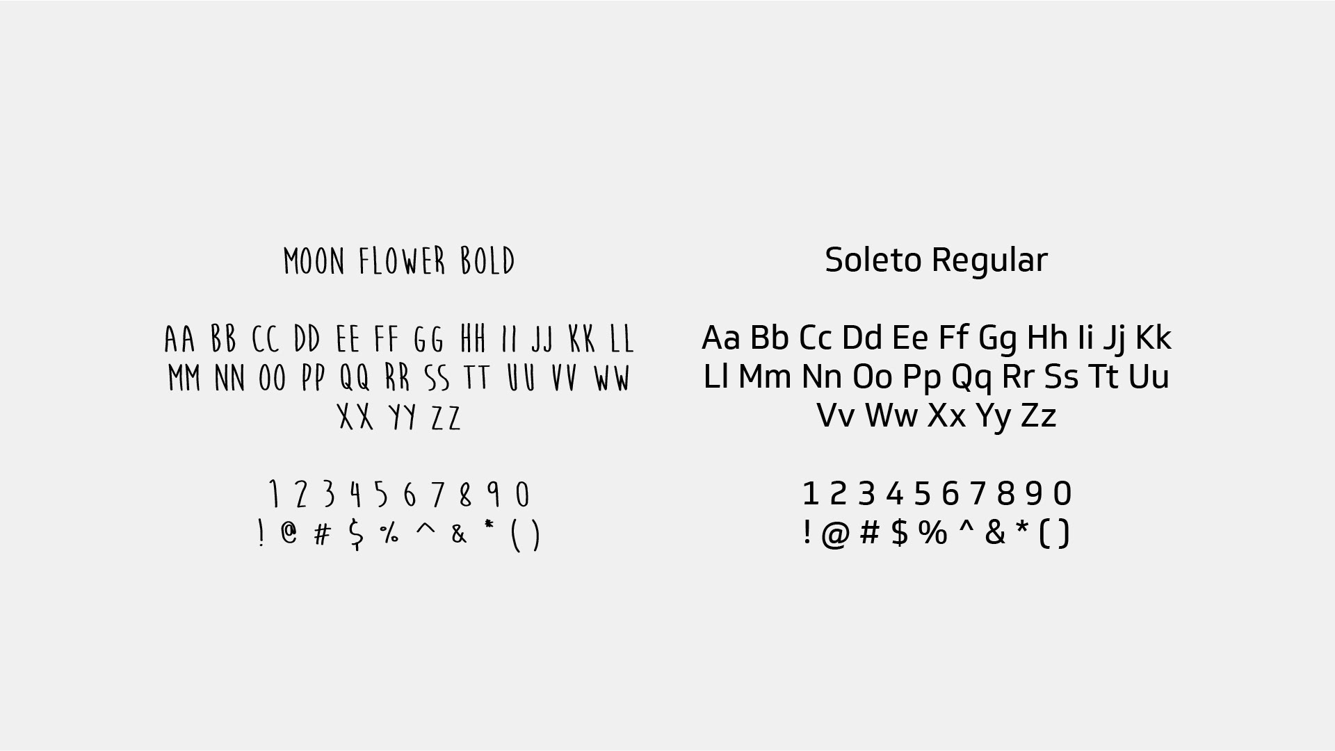
The typefaces are Moon Flower Bold and Soleto Regular. The prior was chosen for its playful and hand crafted style to create the casual and playful environment while the latter is used for body copy for better legibility.
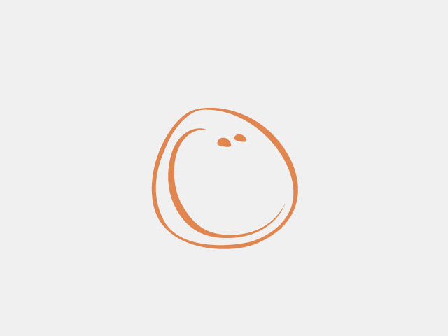
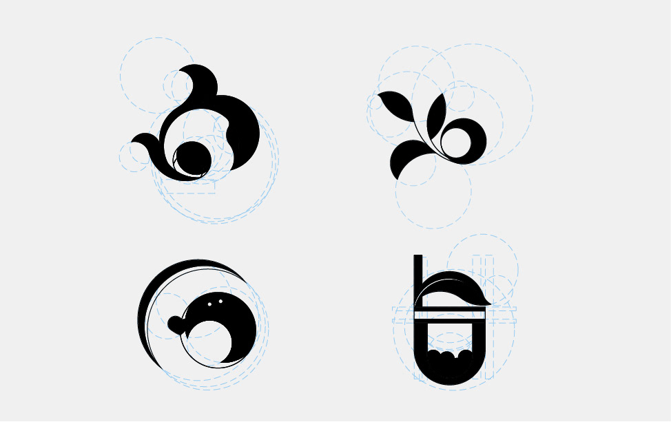
Original Logo Icon
Requires a redesign for a more clean and professional look.

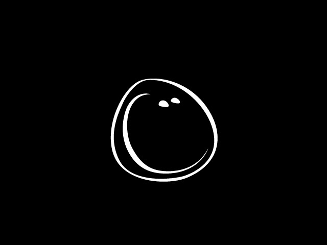
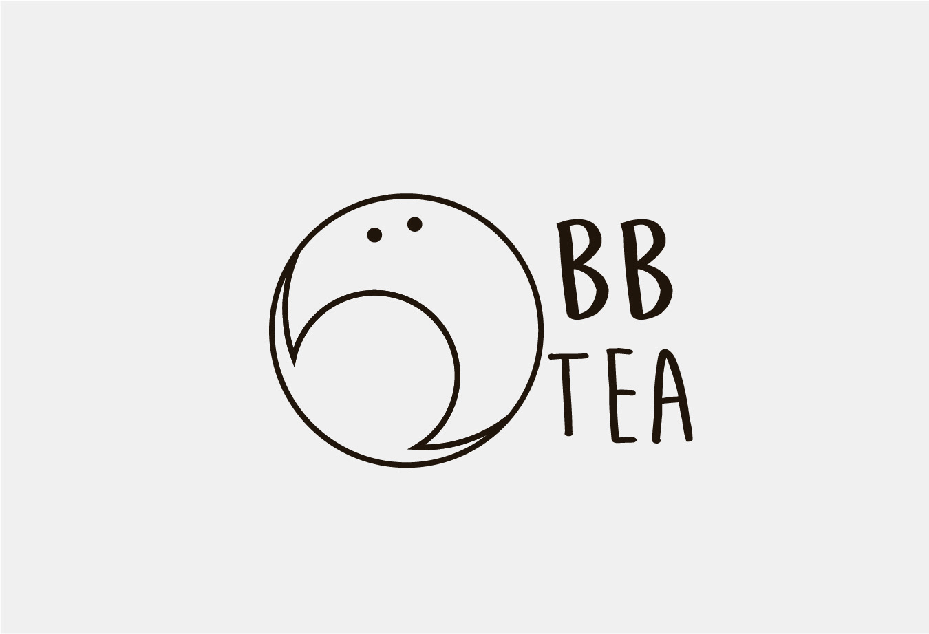
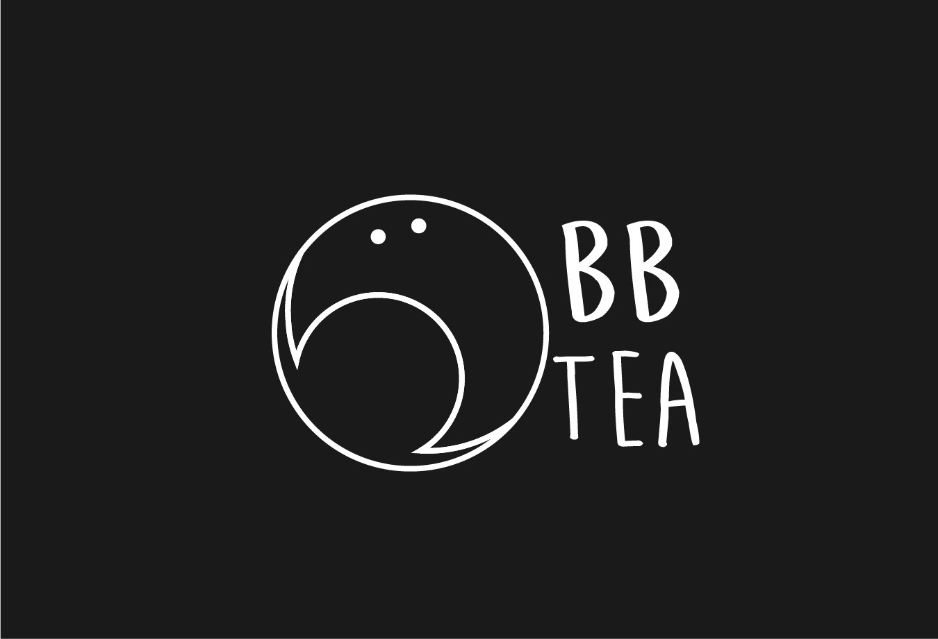
Revised Logo
Cleaned up the lineart for a modern look while keeping the playful attributes.
Design Layouts
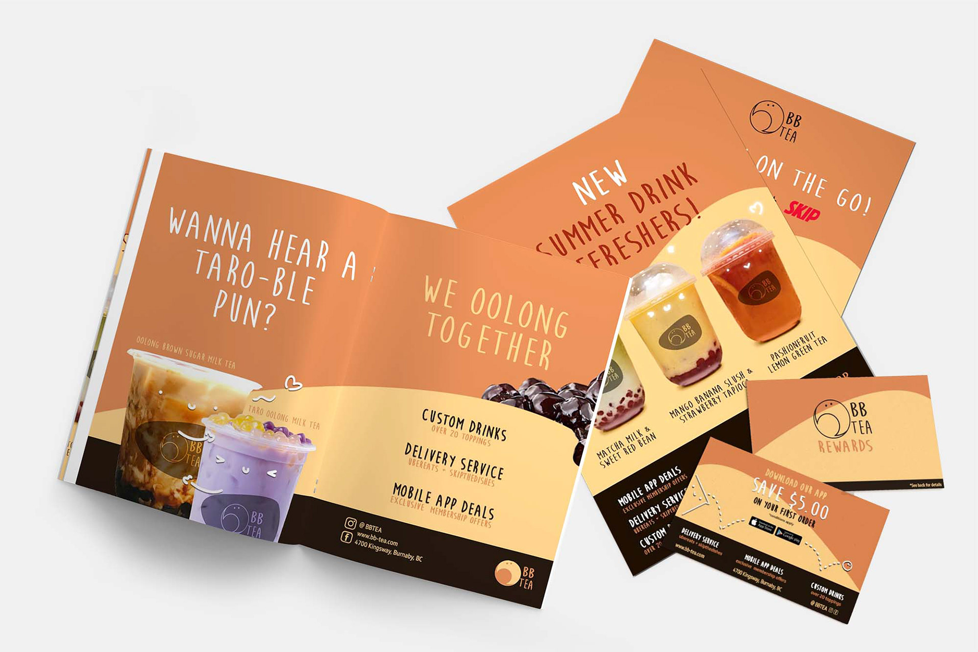
Posters (8.5x11")
Split Page Ad (17x11")
Split Page Ad (17x11")
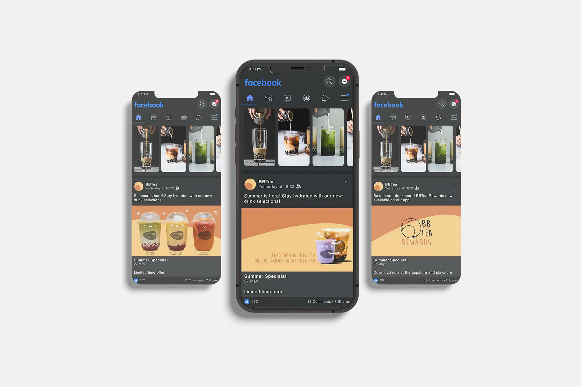
Social Media Post (11.25x11.25")
Social Media Icon (2x2")
Social Media Banner (11.4x4.3")
Handout (6x4")
Social Media Icon (2x2")
Social Media Banner (11.4x4.3")
Handout (6x4")
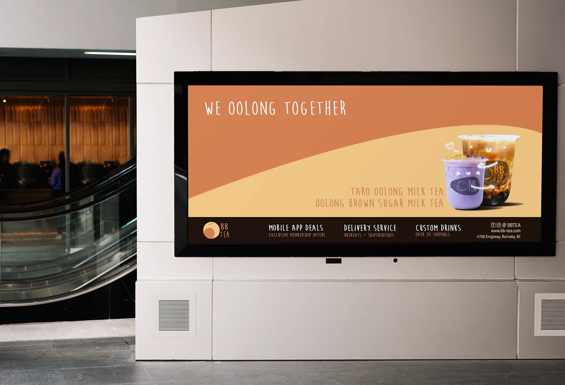
Wide Banner (22.75x11.85")
Extra Wide Banner (22.8x8.6")
Extra Wide Banner (22.8x8.6")
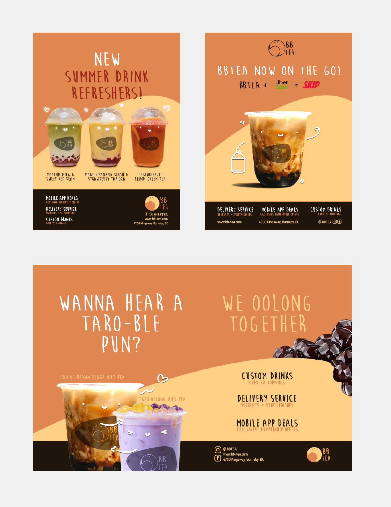
Poster (8.5x11") Split (17x11")
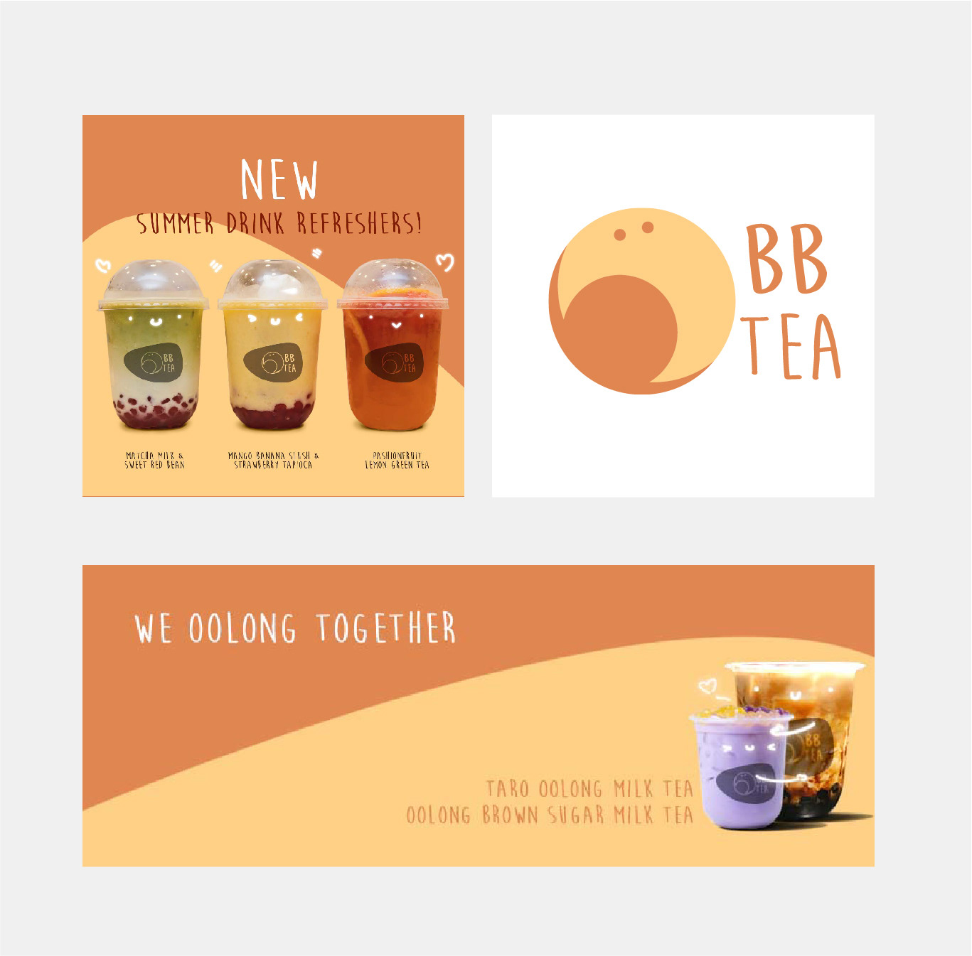
Post (11.25x11.25") Icon (2x2") Banner (11.4x4.3")
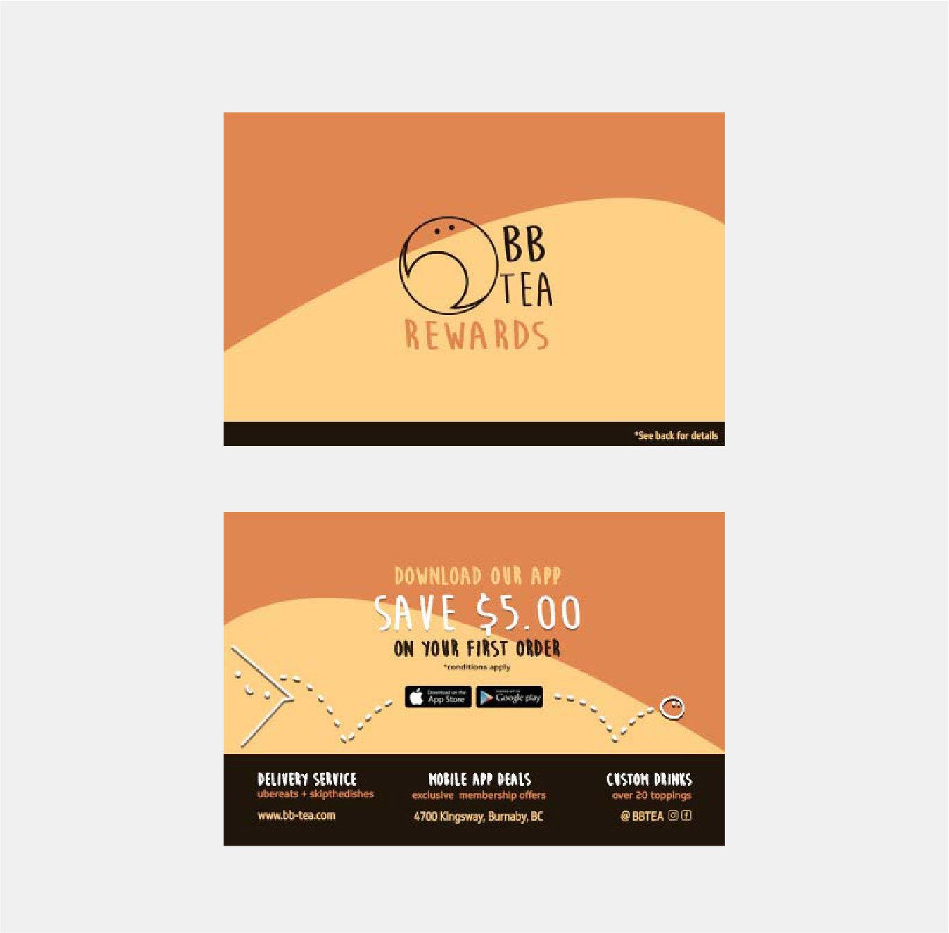
Handout (6x4")
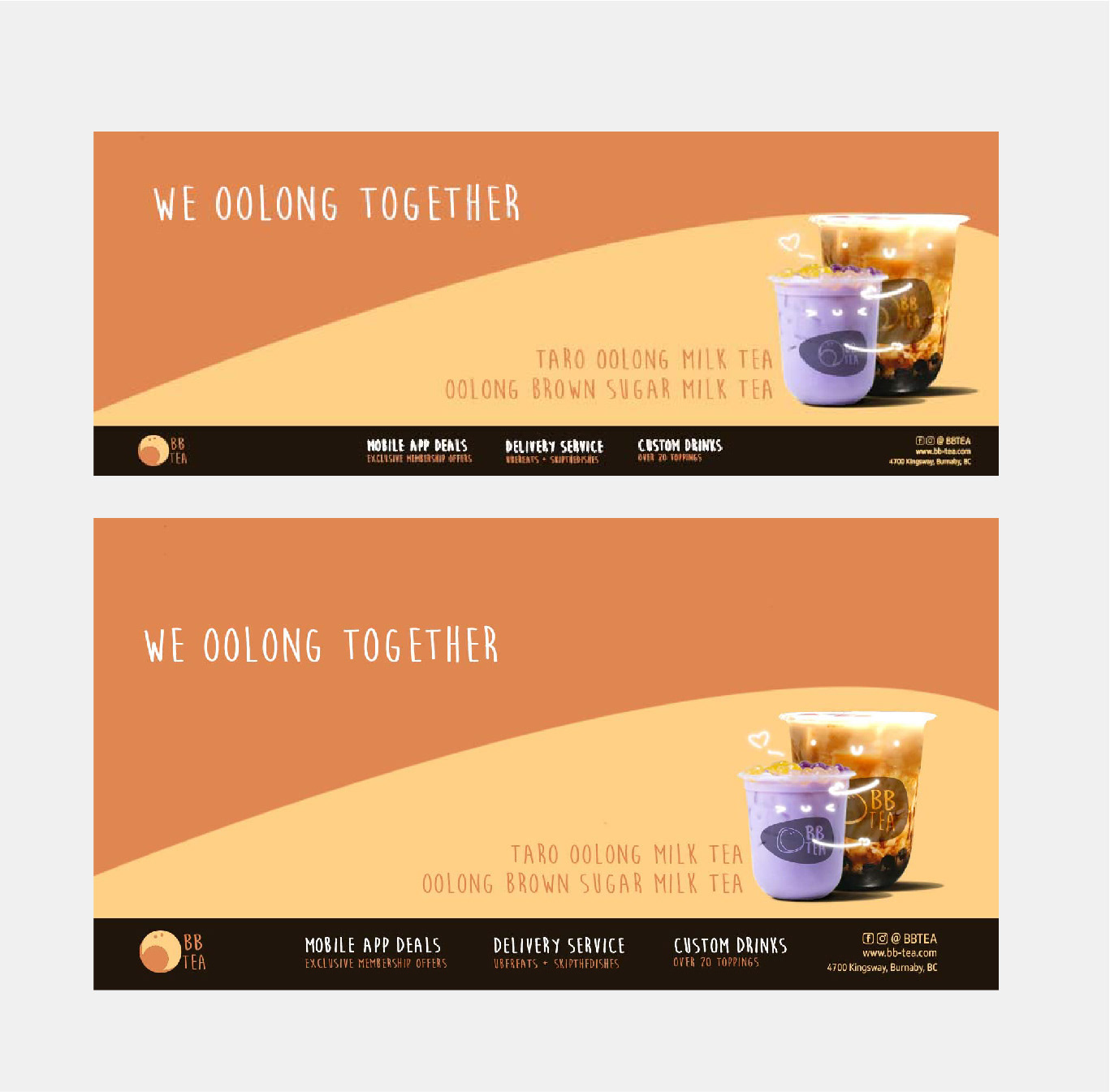
Banner (22.75x11.85) Extra wide Banner (11.4x4.3")
Split-Page ad, Poster assets, handout asset
Social media Facebook posts
Extra-wide billboard asset (22.8x8.6")
Programs Used
Adobe Photoshop, Adobe Illustrator