
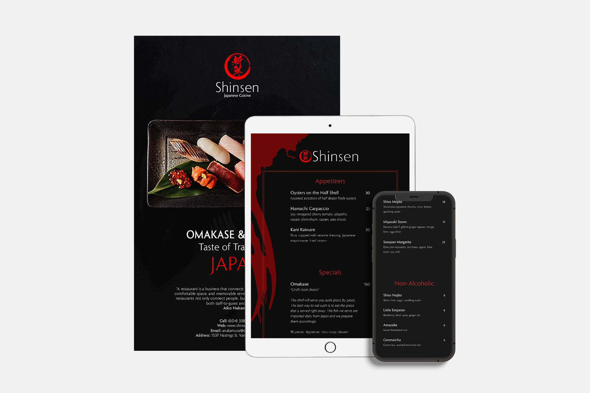
Shinsen is a local Japanese restaurant that needs an update to their food and beverage list in both a printed and digital format. They wish to reach a more high end customer base and desire to have more rich colour, styling, and clarity in the menu to the customers.
Goal:
To create a menu design that can be distinguished as fine dining while producing print advertising assets to help promote their new appearance as well as in-store accessories and business cards.
To create a menu design that can be distinguished as fine dining while producing print advertising assets to help promote their new appearance as well as in-store accessories and business cards.
Challenges:
Rebranding both their print and digital menu in a dimly lit setting while tailoring the design as a lavish restaurant.
Rebranding both their print and digital menu in a dimly lit setting while tailoring the design as a lavish restaurant.
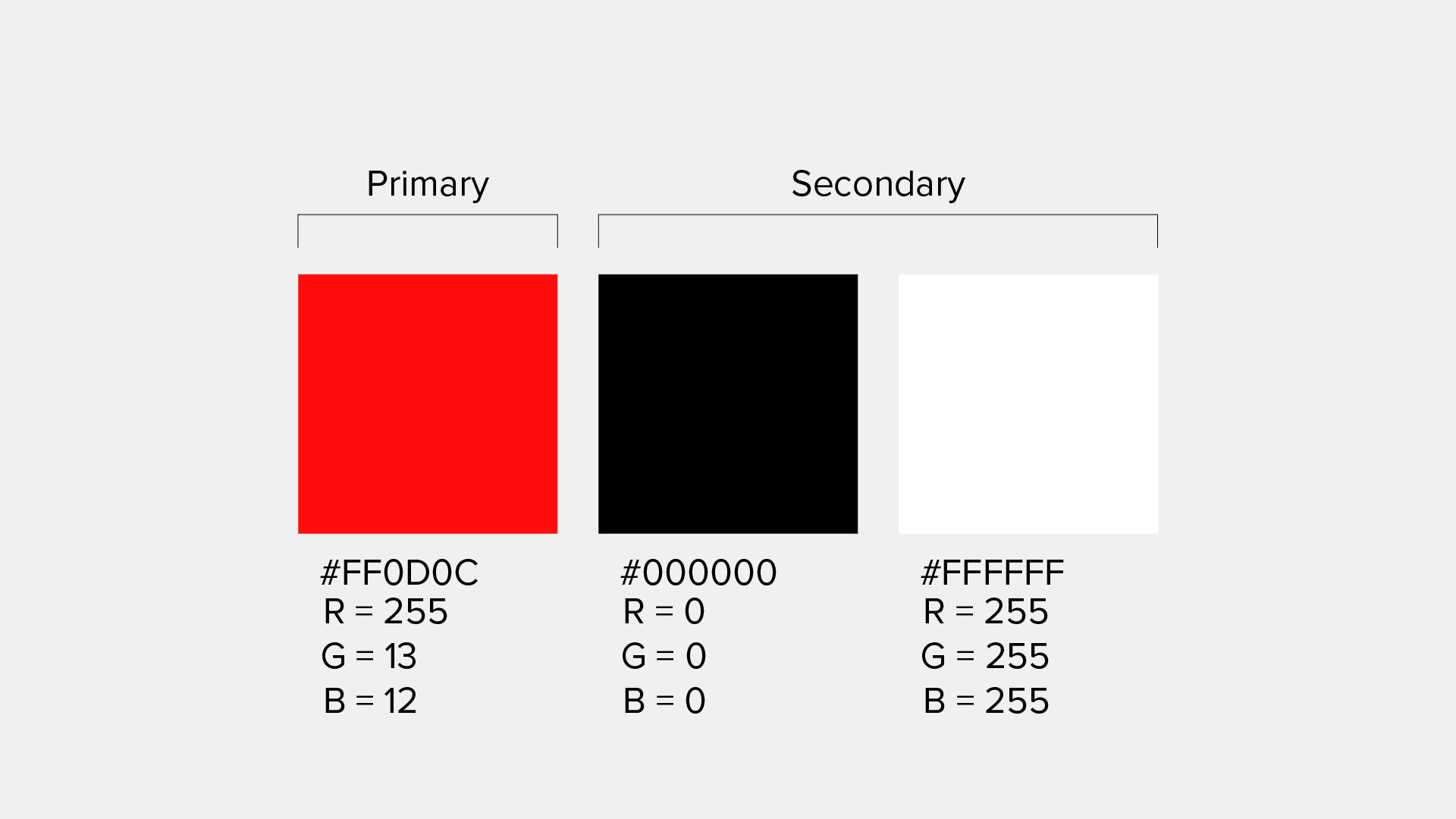
Style Guide
I went with an achromatic colour scheme pairing red with black and white for a very high contrast. Red is also a common colour used in Japan (their National flag) and is considered as a colour of fortune to many Asian countries.
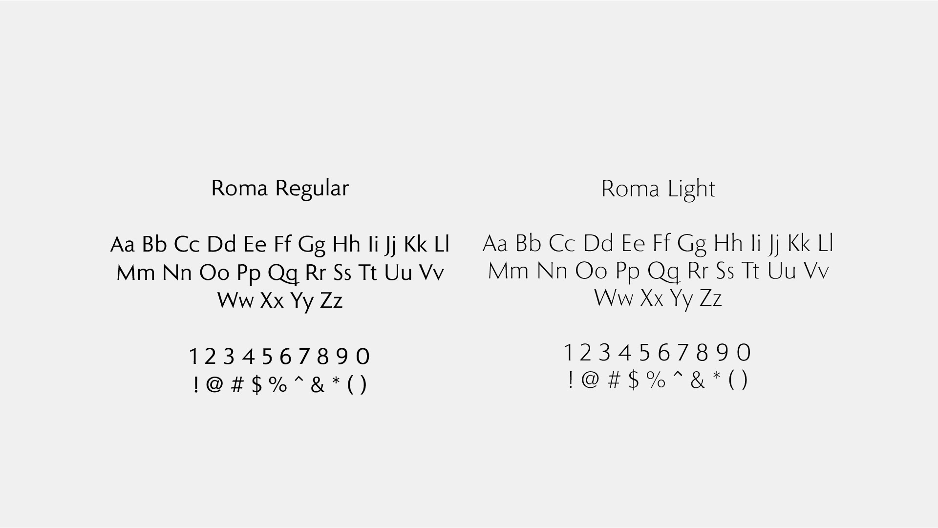
I wanted to keep things modern while also emphasizing the opulent image to match the clientele. To achieve this, I went with the sans serif font Roma for this project. It has a high x-height paired with a humanist style to give it a modern luxurious appeal.
I wanted to keep things modern while also emphasizing the opulent image to match the clientele. To achieve this, I went with the sans serif font Roma for this project. It has a high x-height paired with a humanist style to give it a modern luxurious appeal.
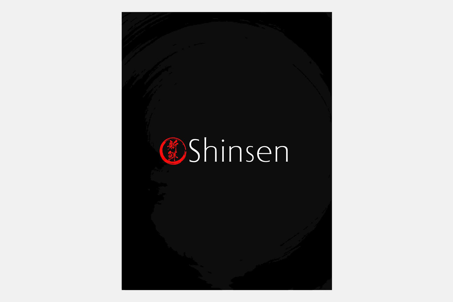
Logo Design
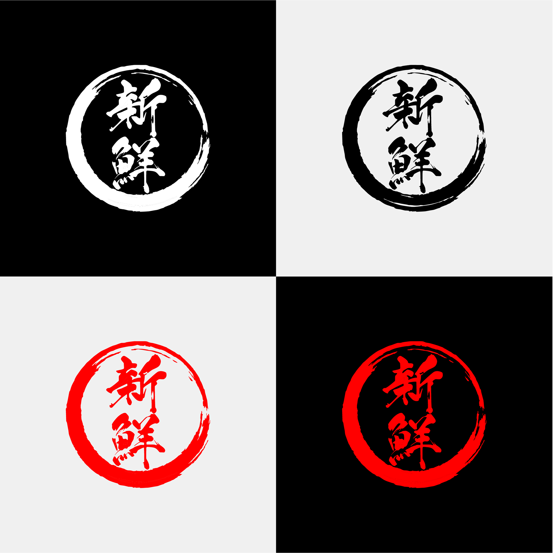
The word "Shinsen" translates to Fresh in Japanese. The logo consists of an elegant wordmark with the typeface Roma paired with a brush stroked calligraphy icon that reads "Shinsen" in Japanese.
The word "Shinsen" translates to Fresh in Japanese. The logo consists of an elegant wordmark with the typeface Roma paired with a brush stroked calligraphy icon that reads "Shinsen" in Japanese.

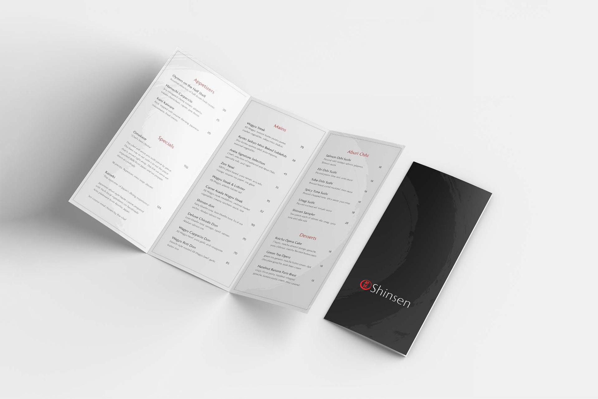
Menu Print
Tri-Fold Menu (3.875x8.5") (3.875x8.5") (3.625x8.5")
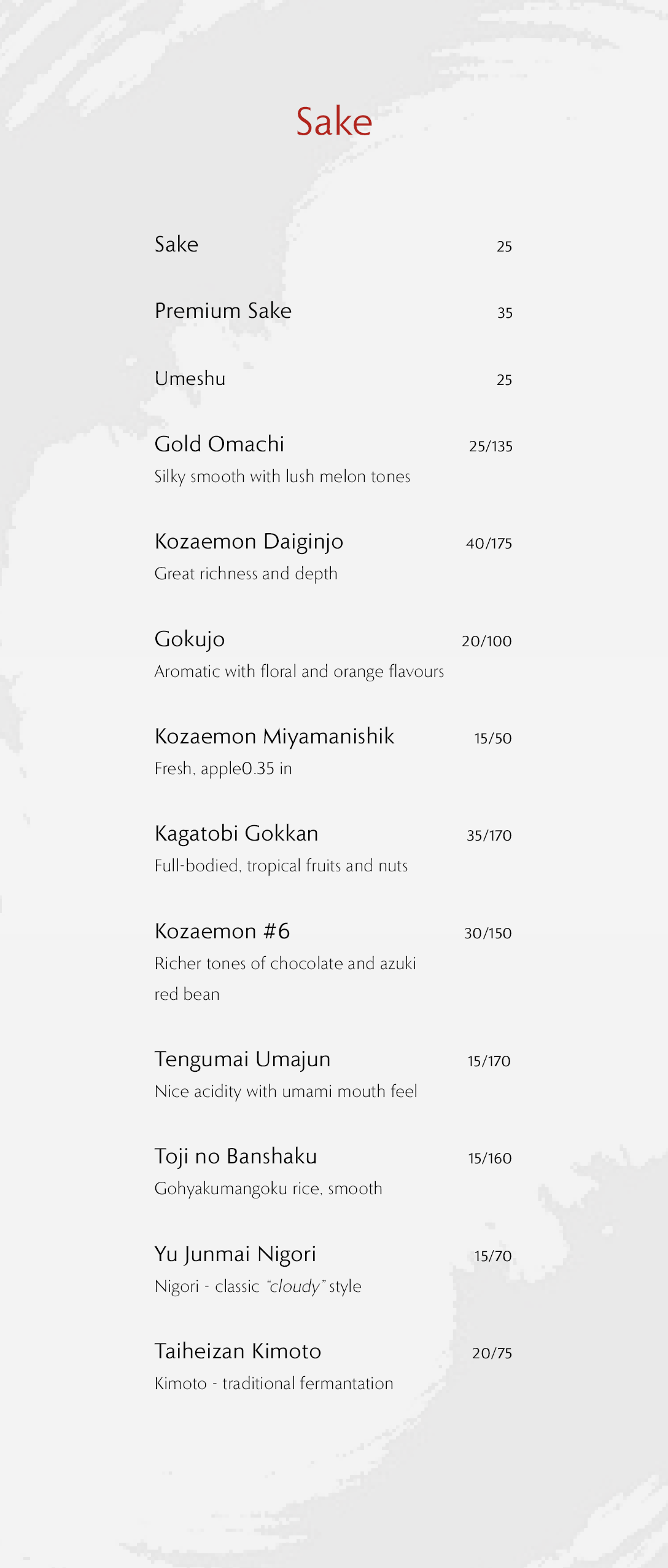
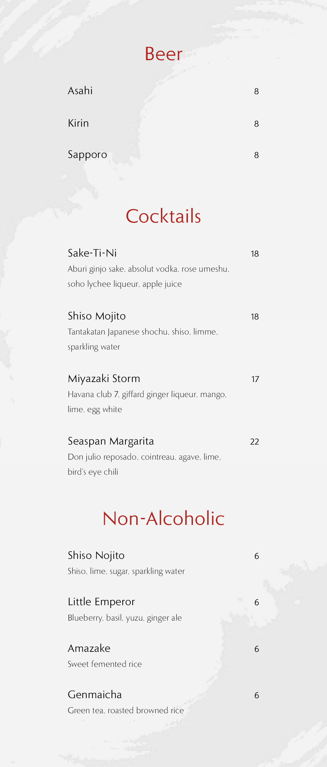
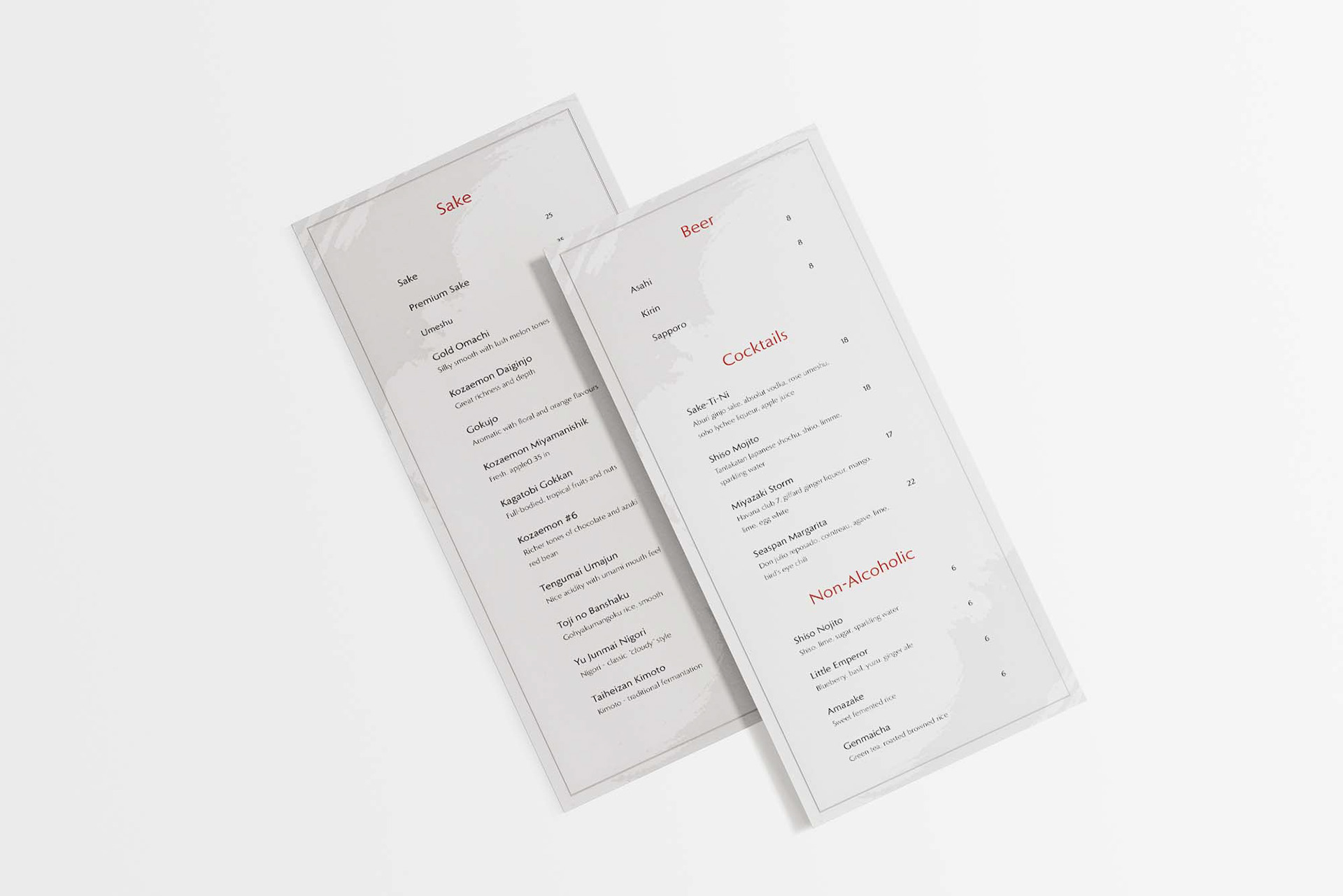
Drink Insert (3.625x8.5")
Drink Insert (3.625x8.5")
I wanted to create a traditional yet modern and upper class appeal in the design. By achieving this, I used a subtle calligraphic backdrop in the design paired with clean typography and alignment. The headline sections consists of a slightly darker shade than the logo to create better contrast and overall balance.
Cover Print Menu
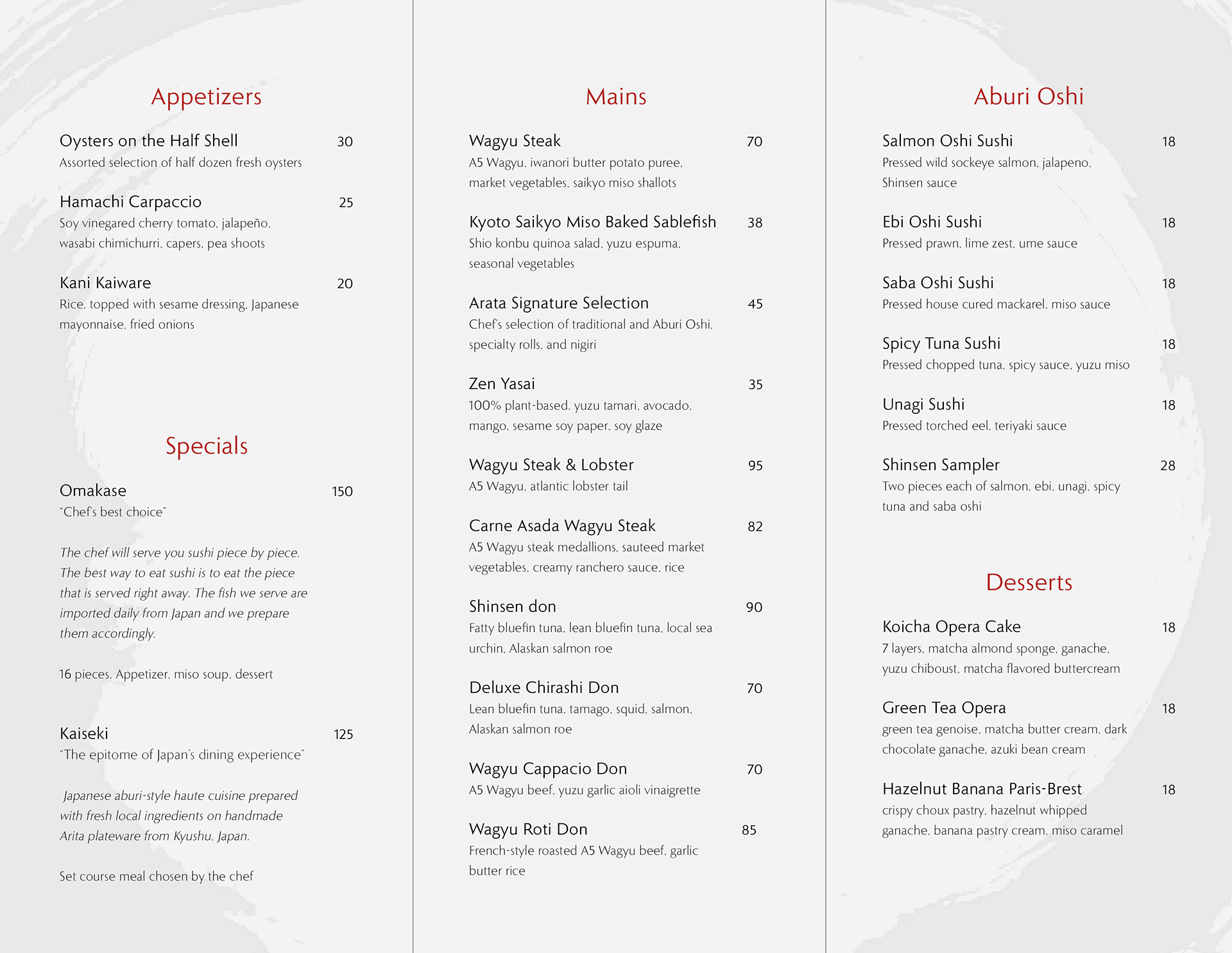
Tri-Fold Menu (3.875x8.5") (3.875x8.5") (3.625x8.5")
Drink Insert (3.625x8.5")
Drink Insert (3.625x8.5")
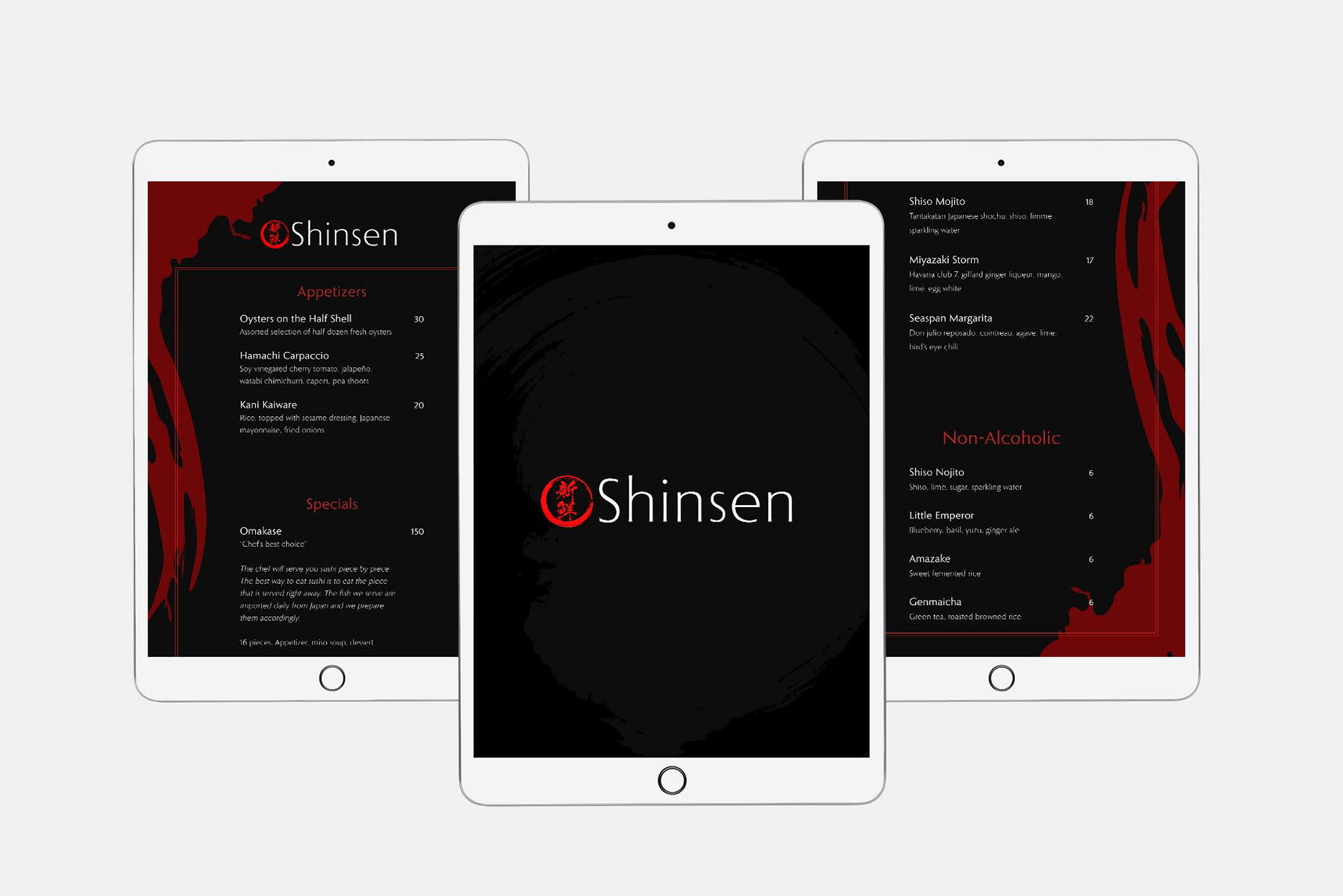
Menu Digital
iPad Pro (2048x2732px)
iPhone 12 (1170x2532px)
iPhone 12 (1170x2532px)
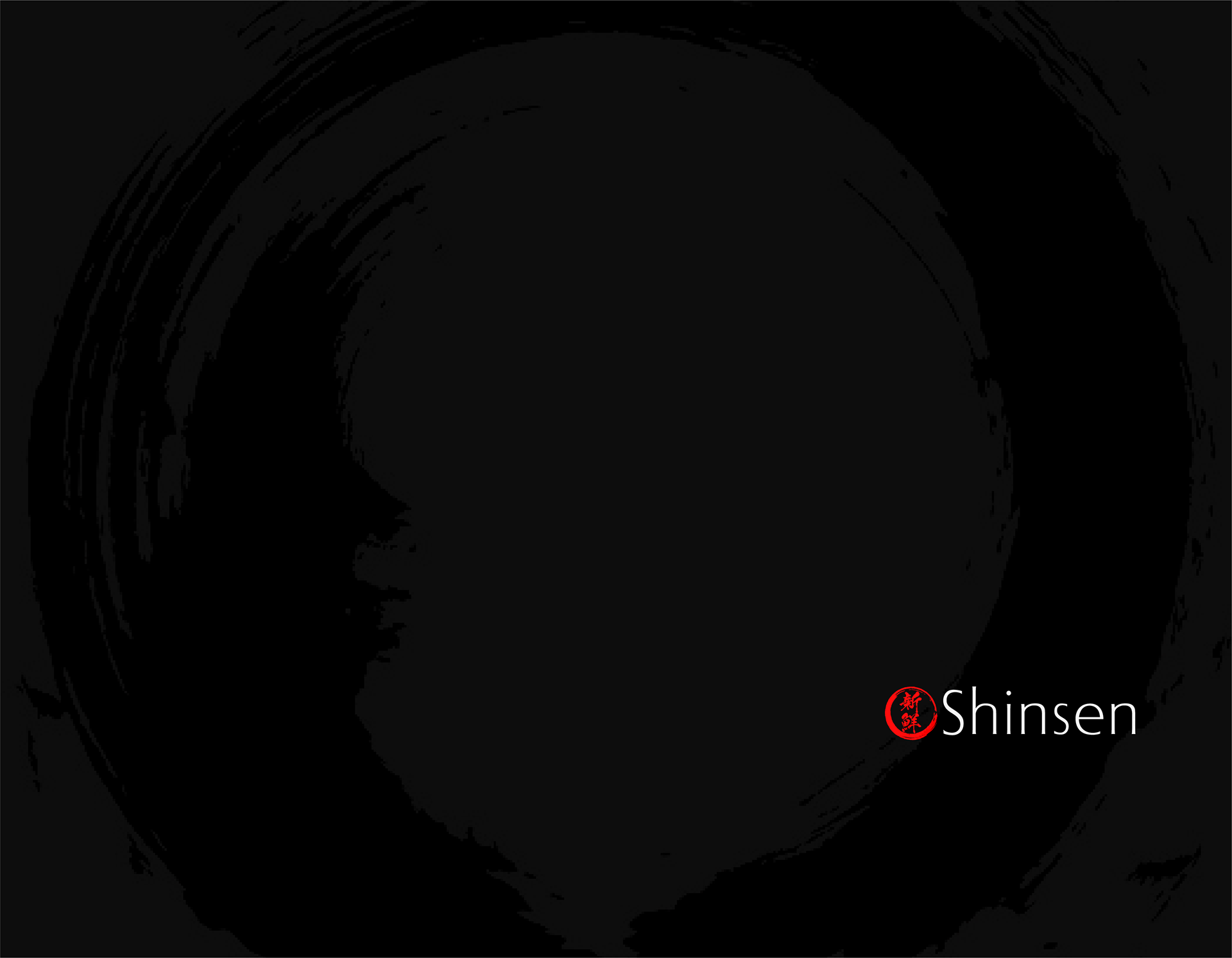
A dark background is used to account for the low light setting of the restaurant. This also gives the menu a modern and lavish look. Both digital menus are viewed in portrait mode.
Splash Page iPad

iPad Menu 1 - 2
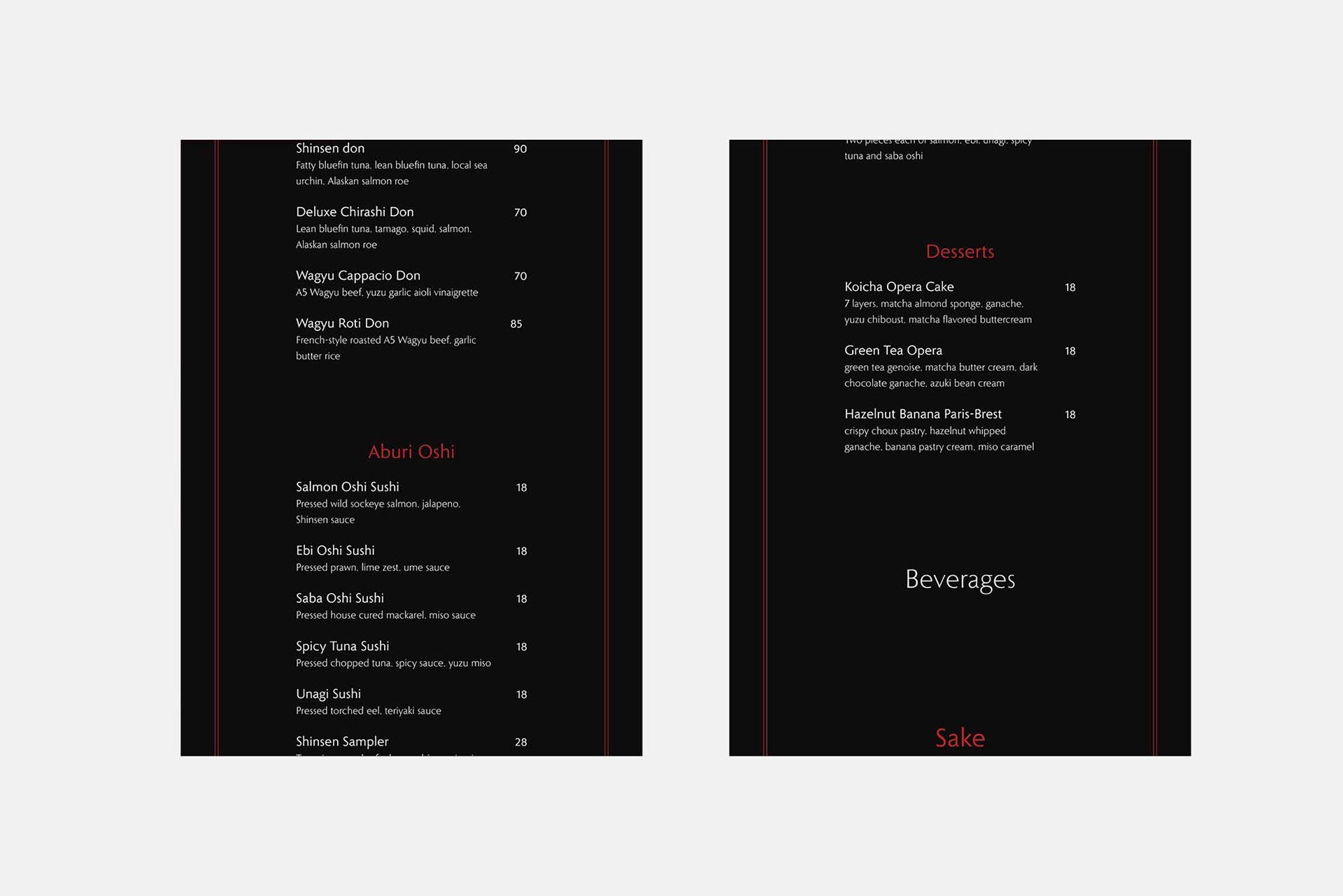
iPad Menu 3 - 4
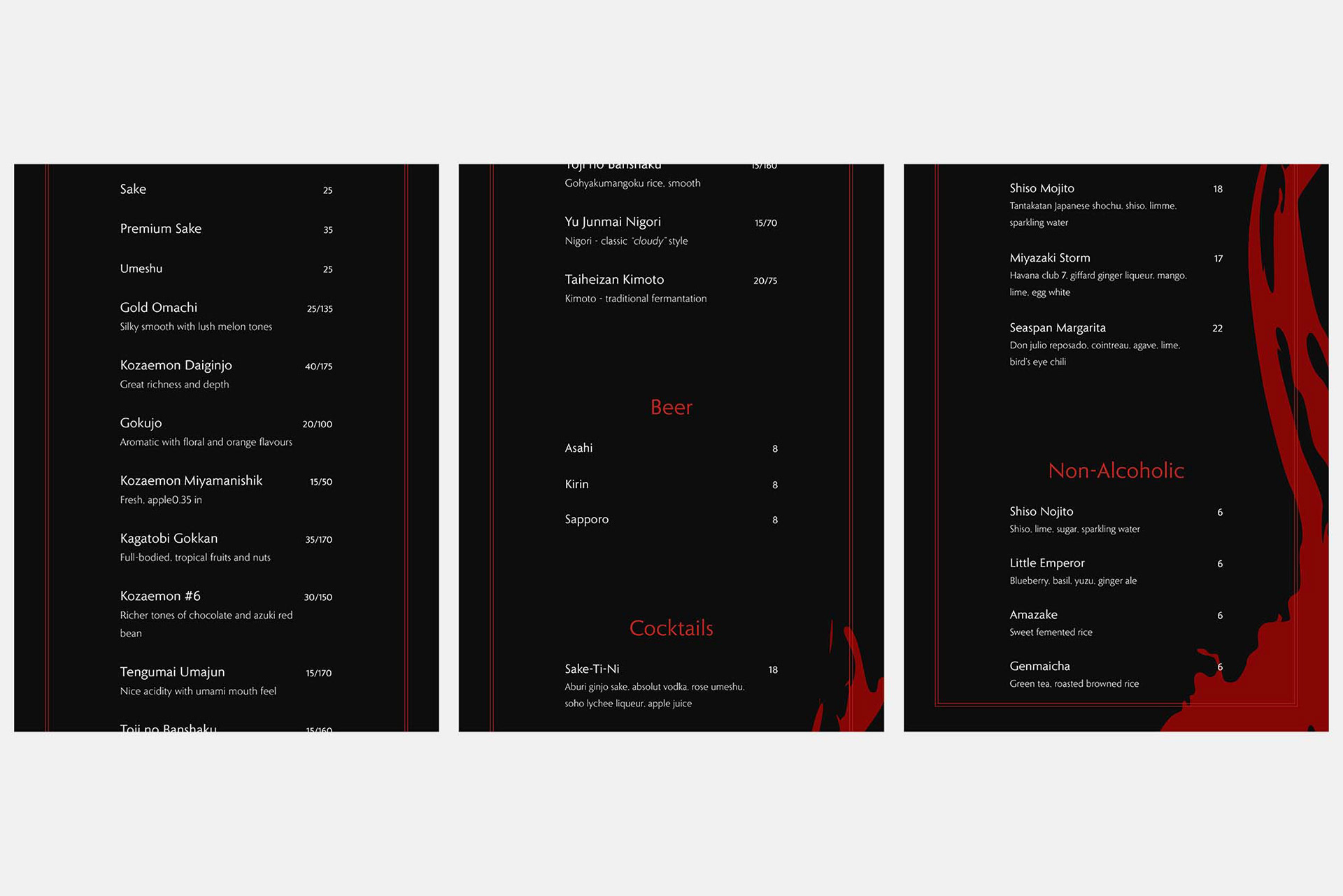
iPad Menu 5 - 7
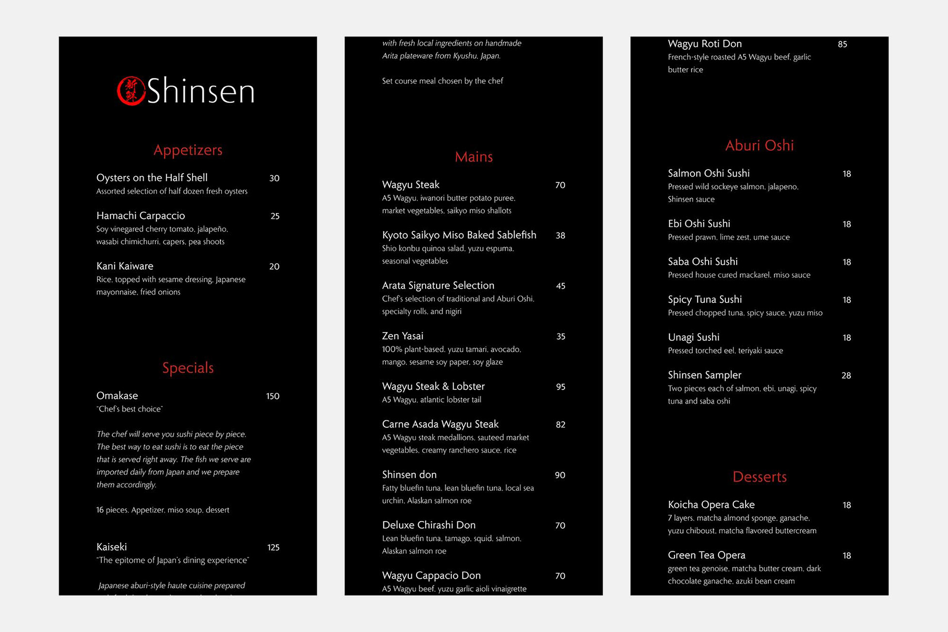
iPhone Menu 1 - 3
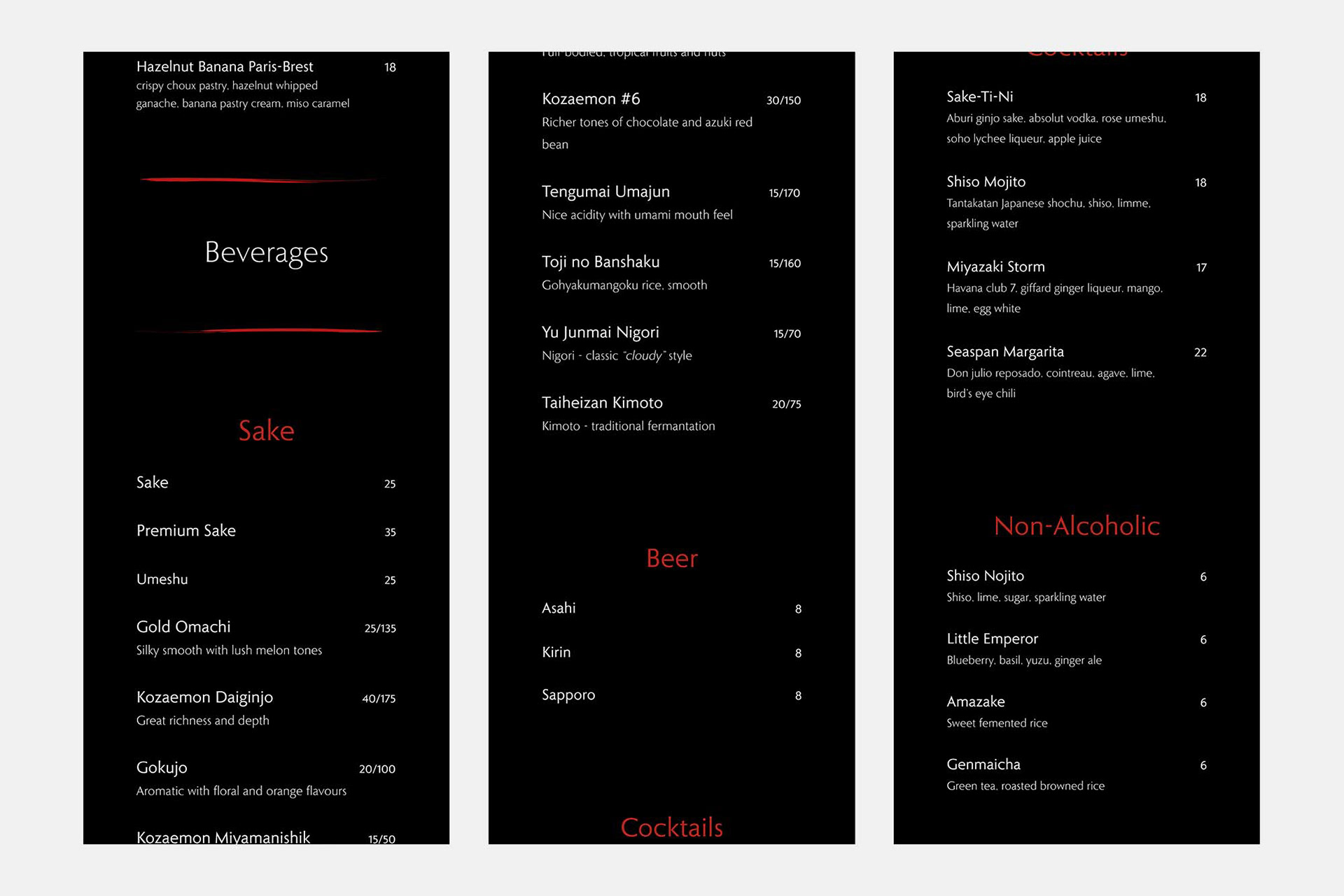
iPhone Menu 4 - 6
Menu Print
Tri-Fold Menu
Drink Insert
Menu Digital
The boxed frame and red graphic was removed in the mobile version for more spacing to keep it minimalistic.
iPad menu
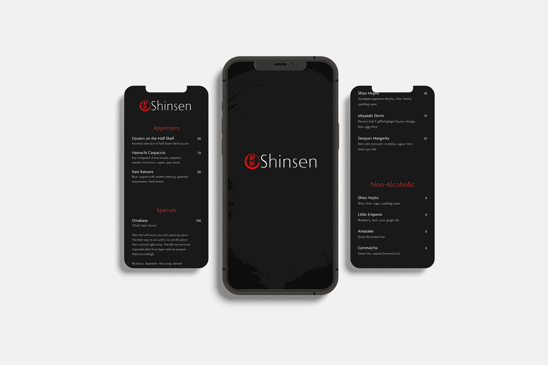
iPhone menu
Advertising Assets
Print Ad (8.3x11.7")
Digital Ads (1080x1080px)
Digital Ads (1080x1080px)
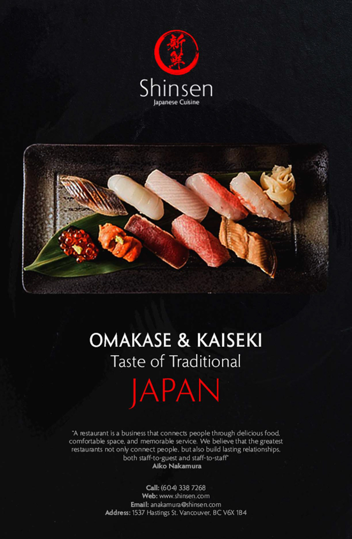
Print Ad (8.3x11.7")
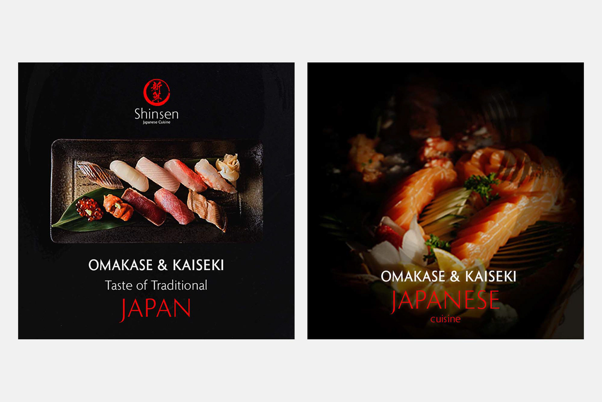
Digital Ad (1080x1080px)
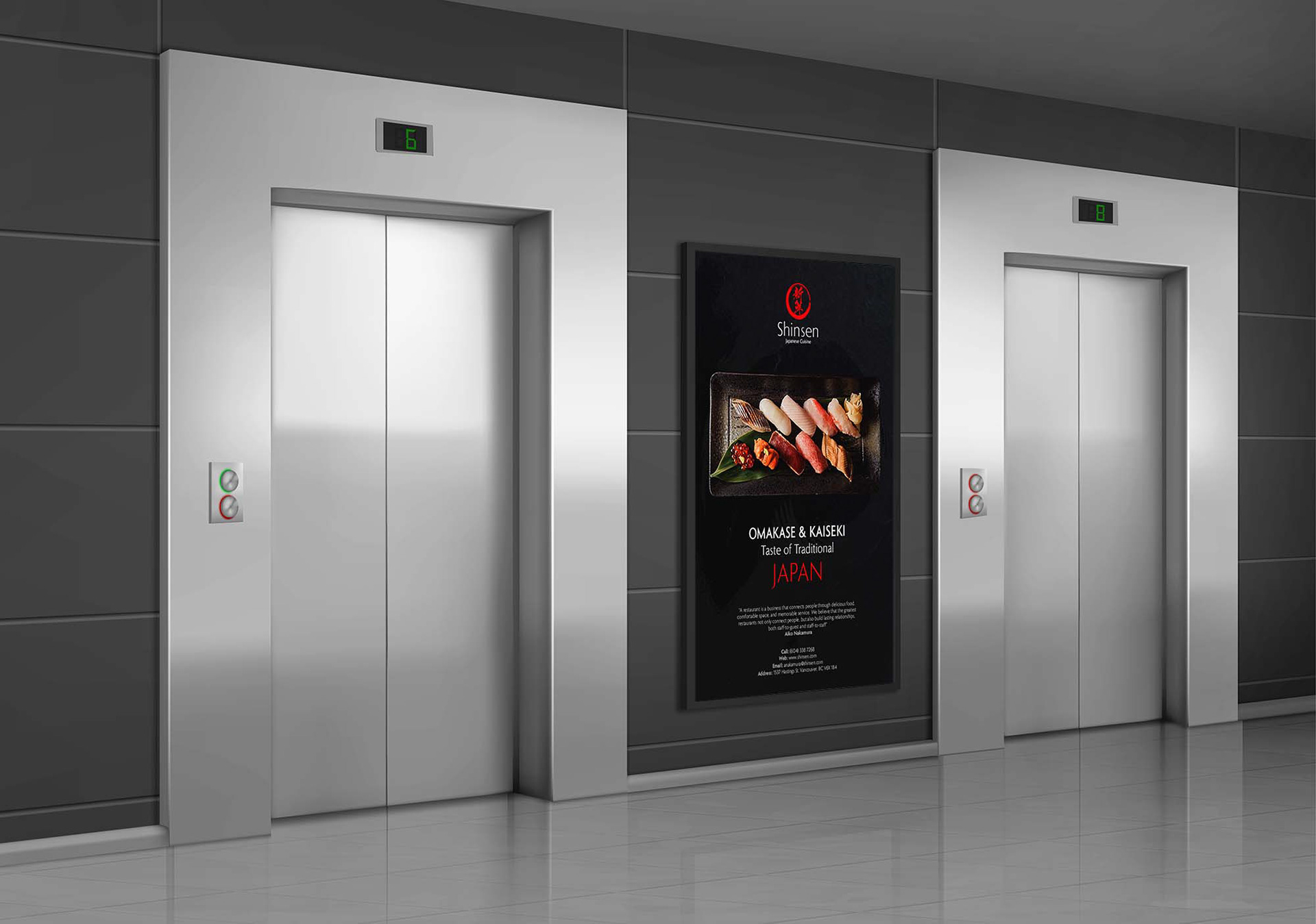
Poster Ad
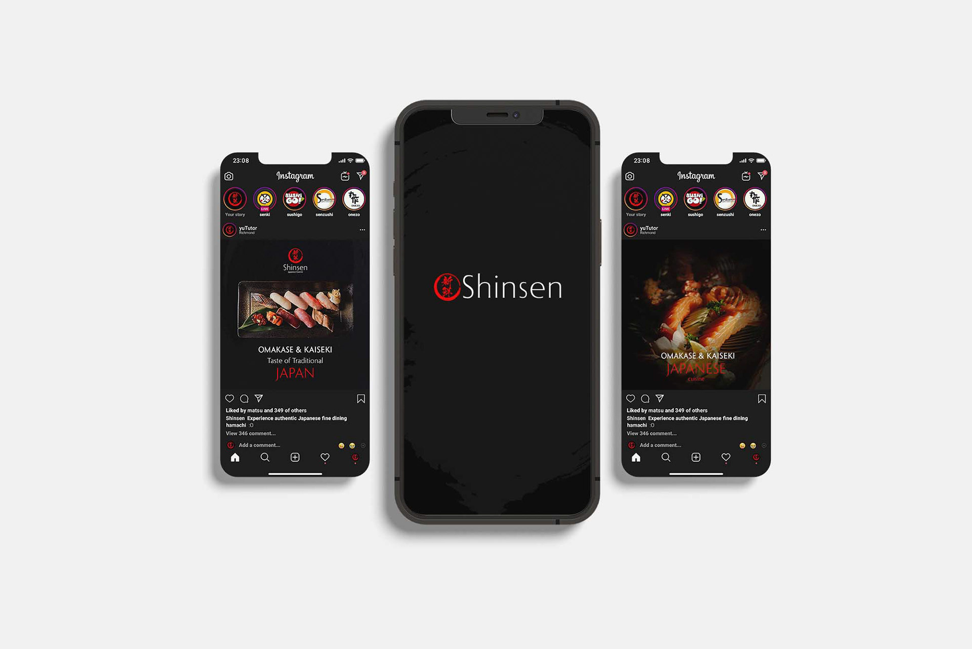
Instagram Ad
Accessories
Chef's Apron, Service Plate, Business Card
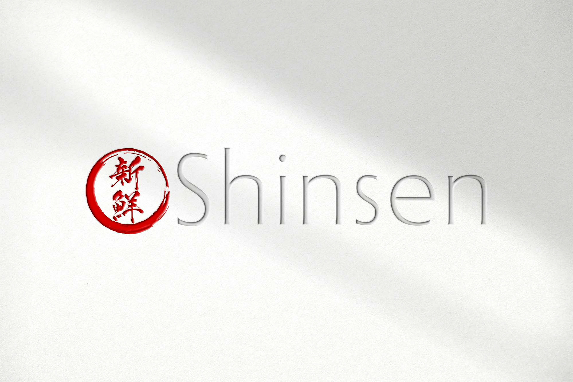
Storefront with brand engraved
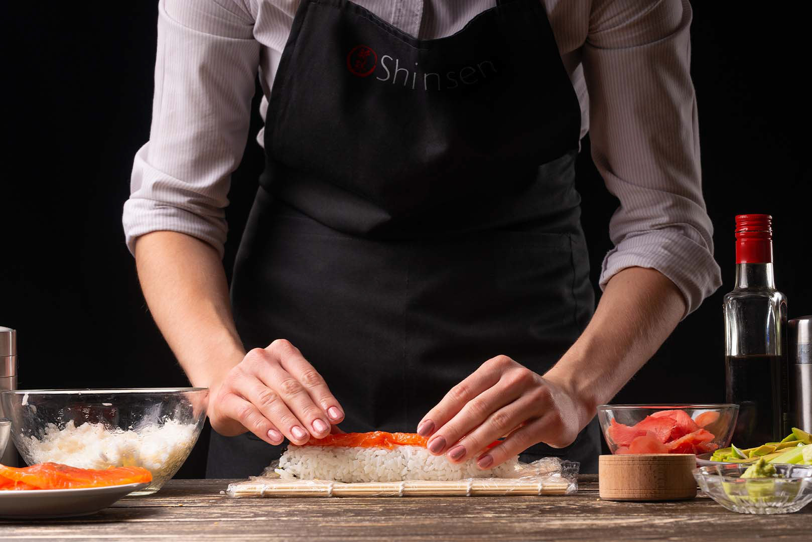
Chef's Apron
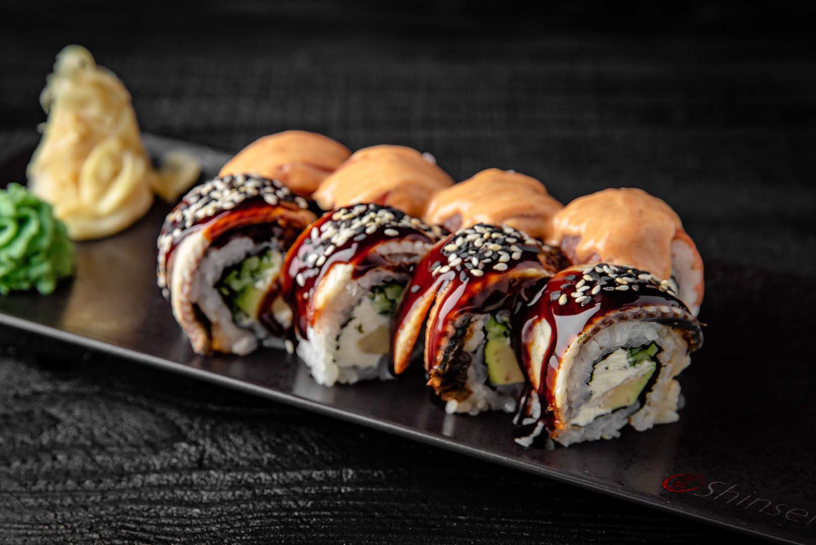
Service Plate
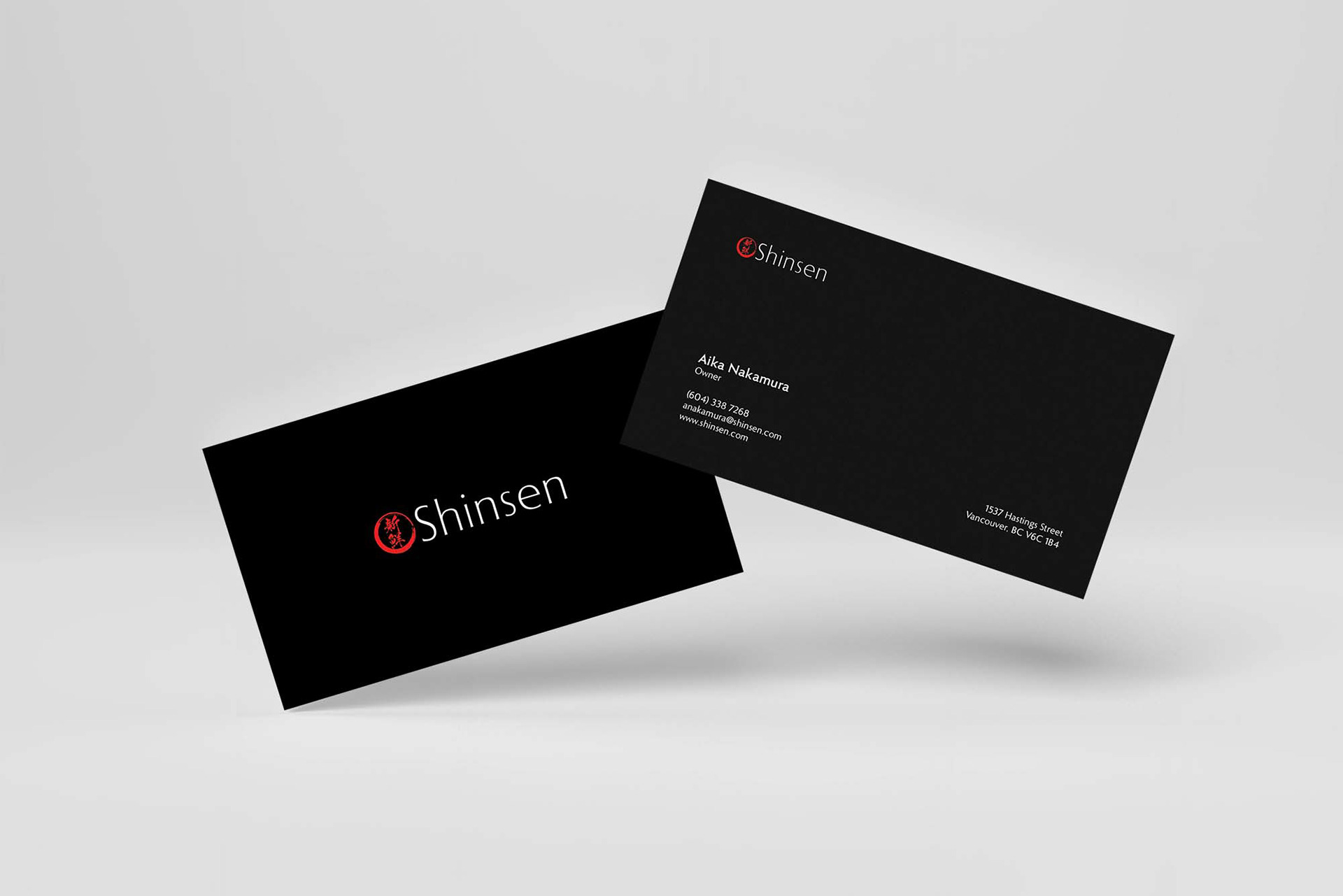
Business Card
Programs Used
Adobe InDesign, Adobe Photoshop, Adobe Illustrator